Prelude
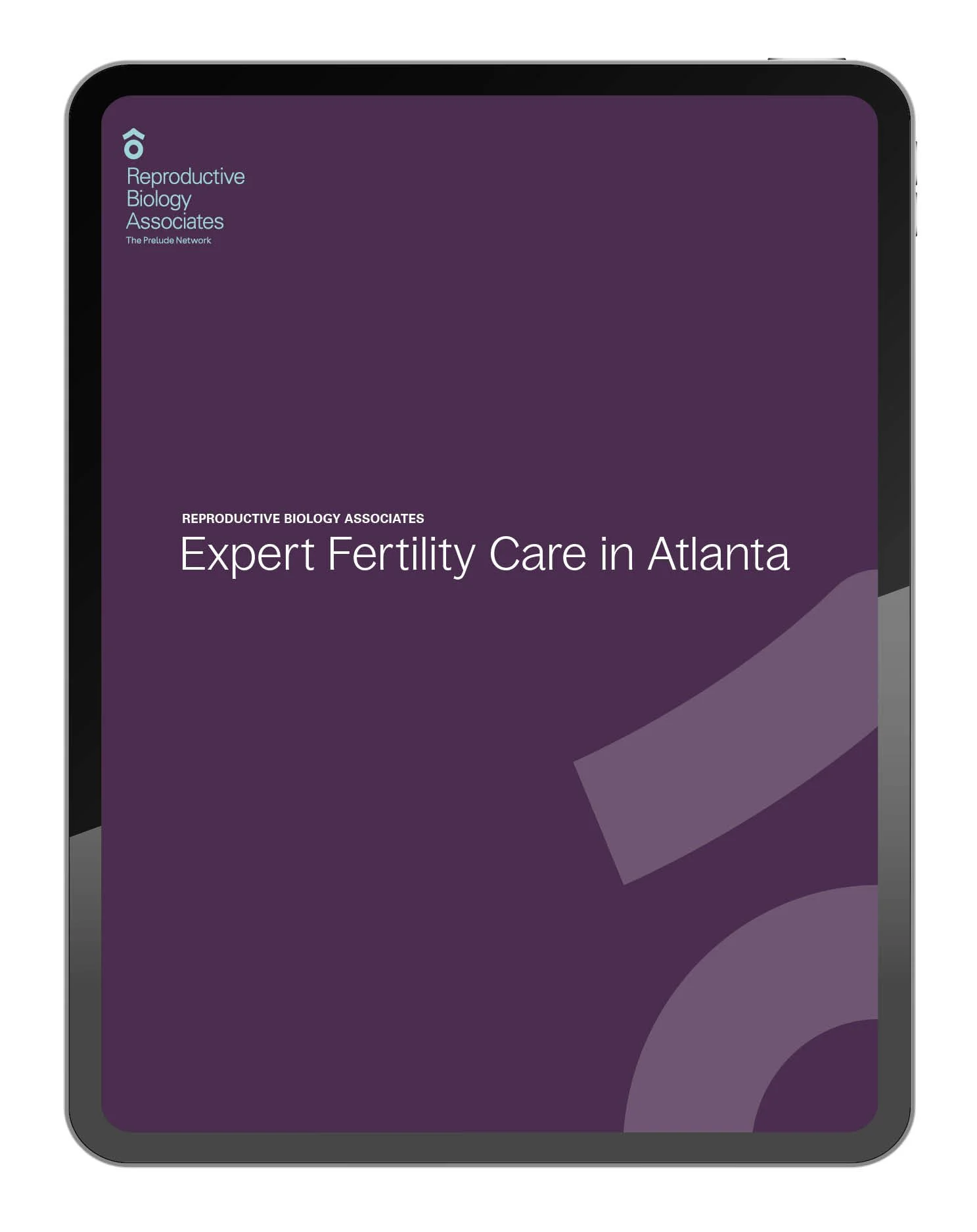
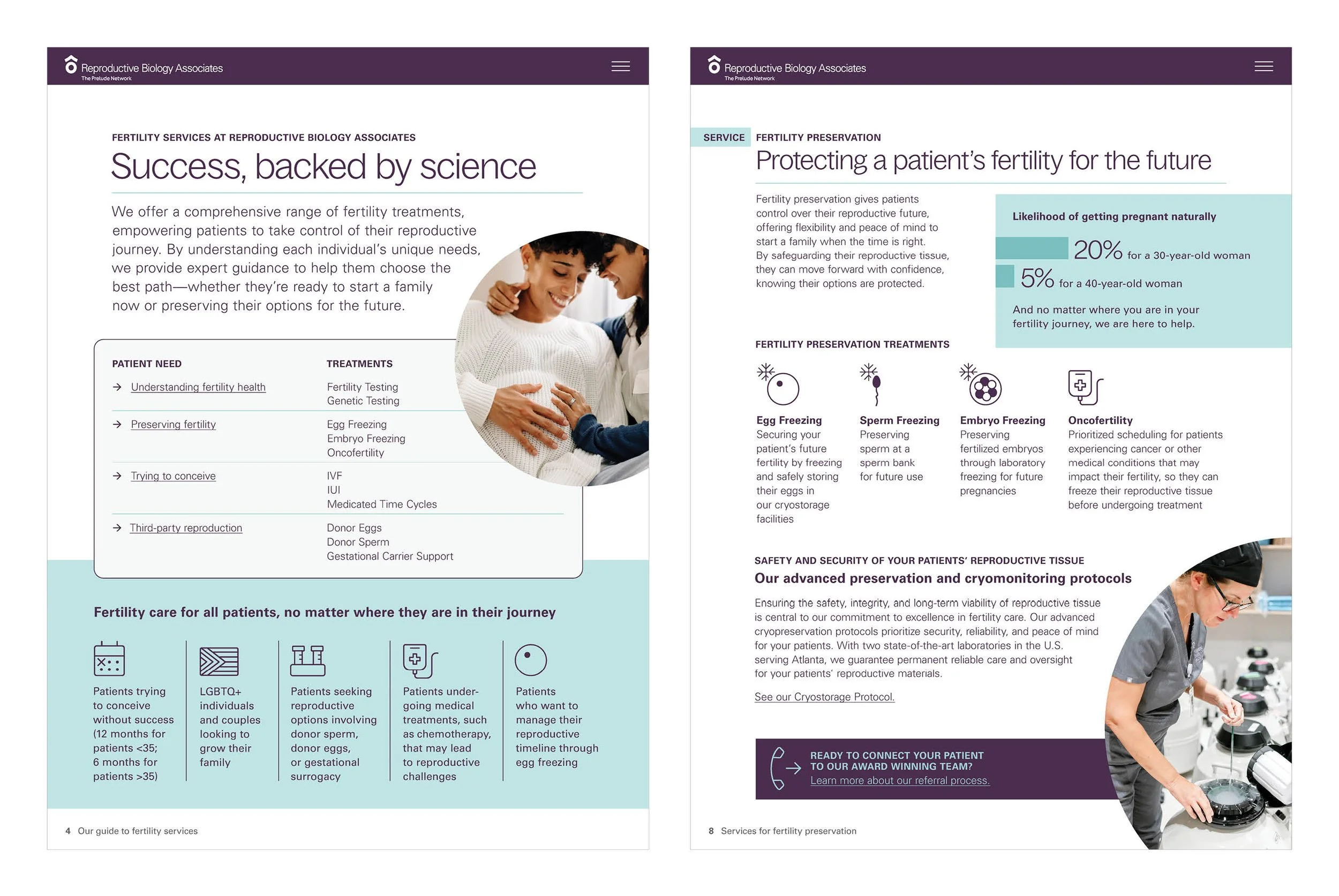
The team at West in Portland reached out to me to create an interactive PDF for their client, Prelude Fertility, to use in their facilities around the country. I built out a 16-page clickable PDF that felt gentle, feminine and informative.
Client: West for The Prelude Network.
Chelsea’s Fund
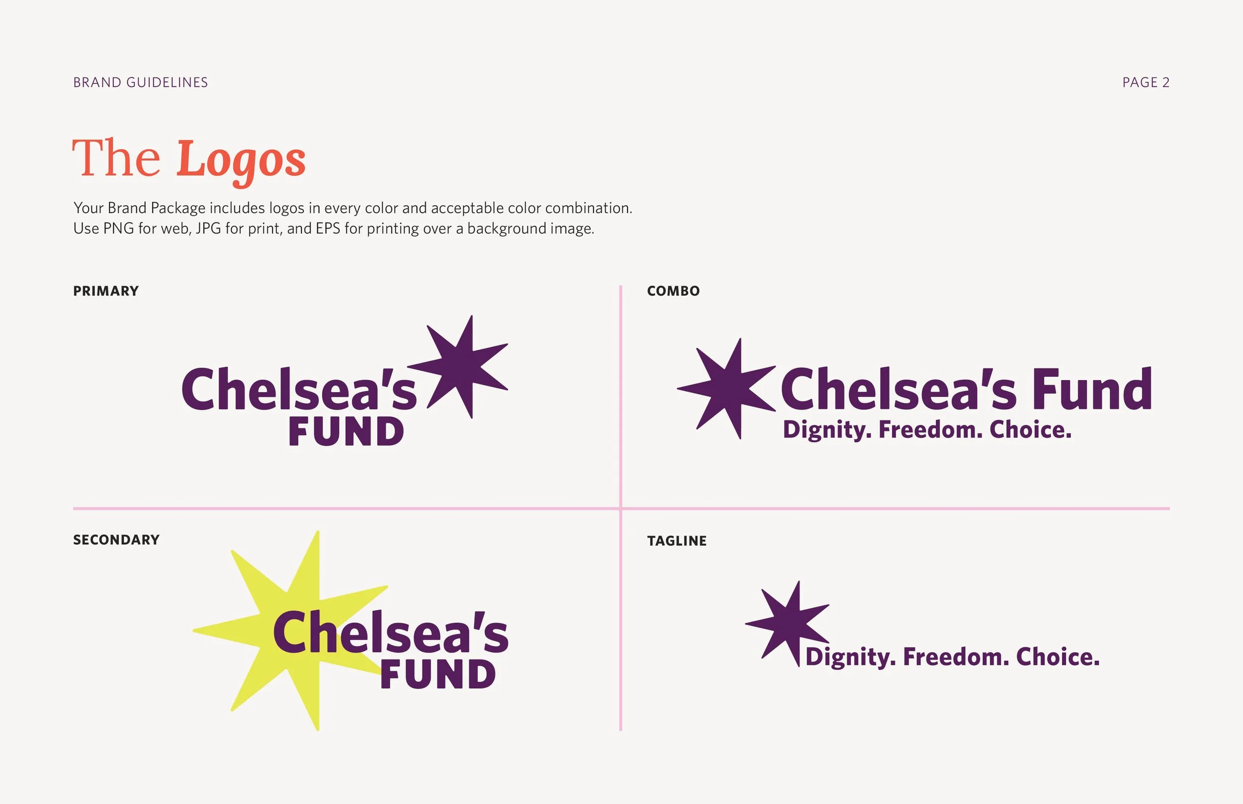
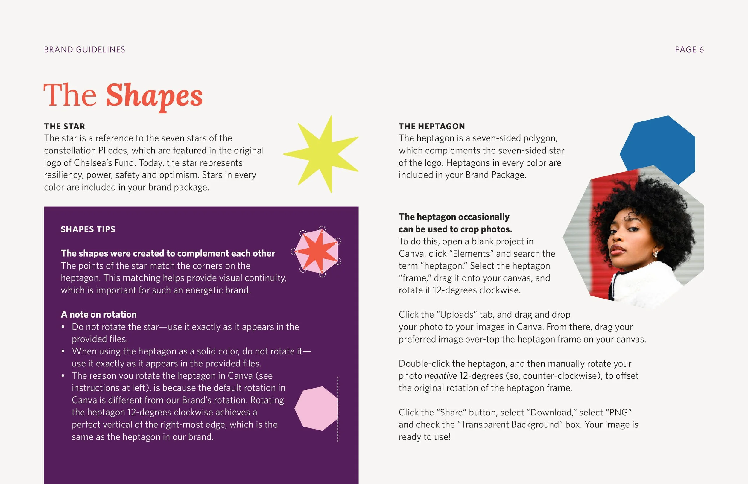
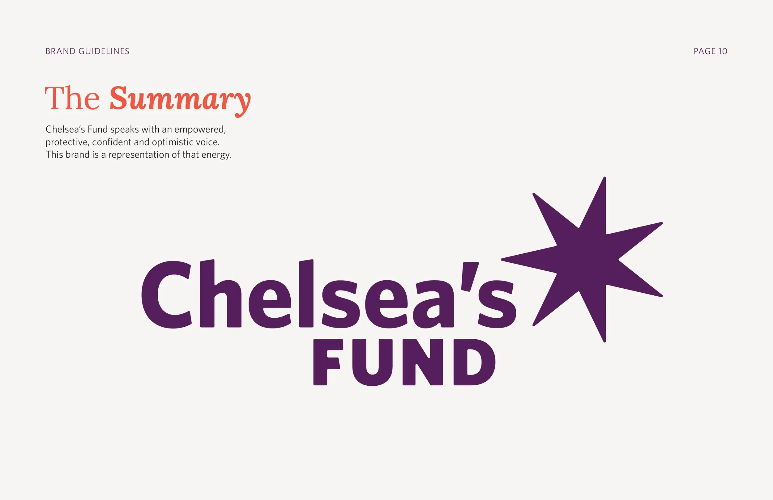
This Wyoming non-profit was ready for a rebrand that infused energetic optimism to their identity. Established in 1998, Chelsea’s Fund helps people across Wyoming access abortion care. I created a logo that incorporated a seven-pointed star—a nod to the constellation Pleiades, which appeared in their previous logo—to convey brightness, hope and empowerment. Paired with a modern typeface, the mark helped the Chelsea’s Fund team turn a corner in how they present themselves to the world.
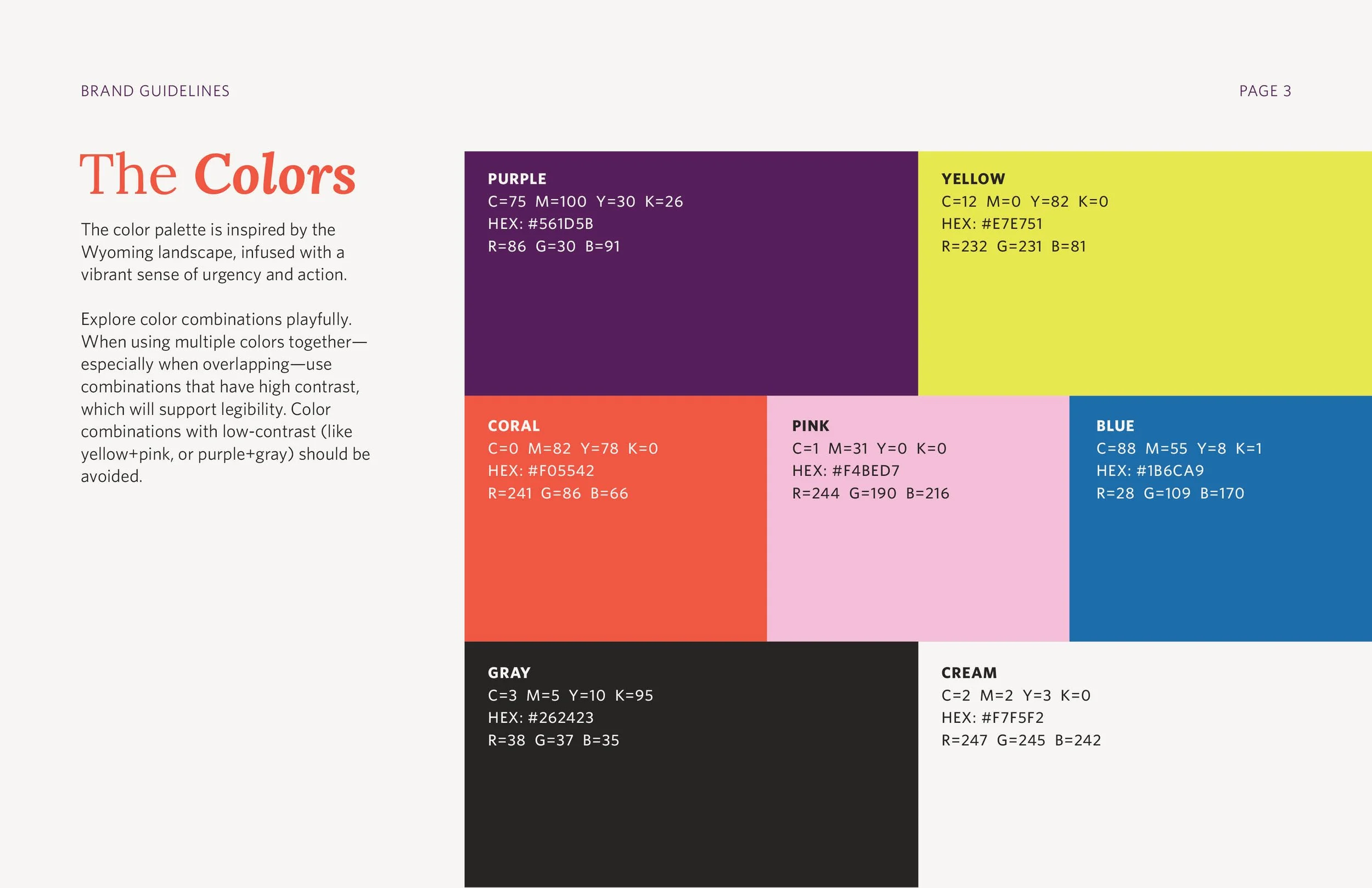
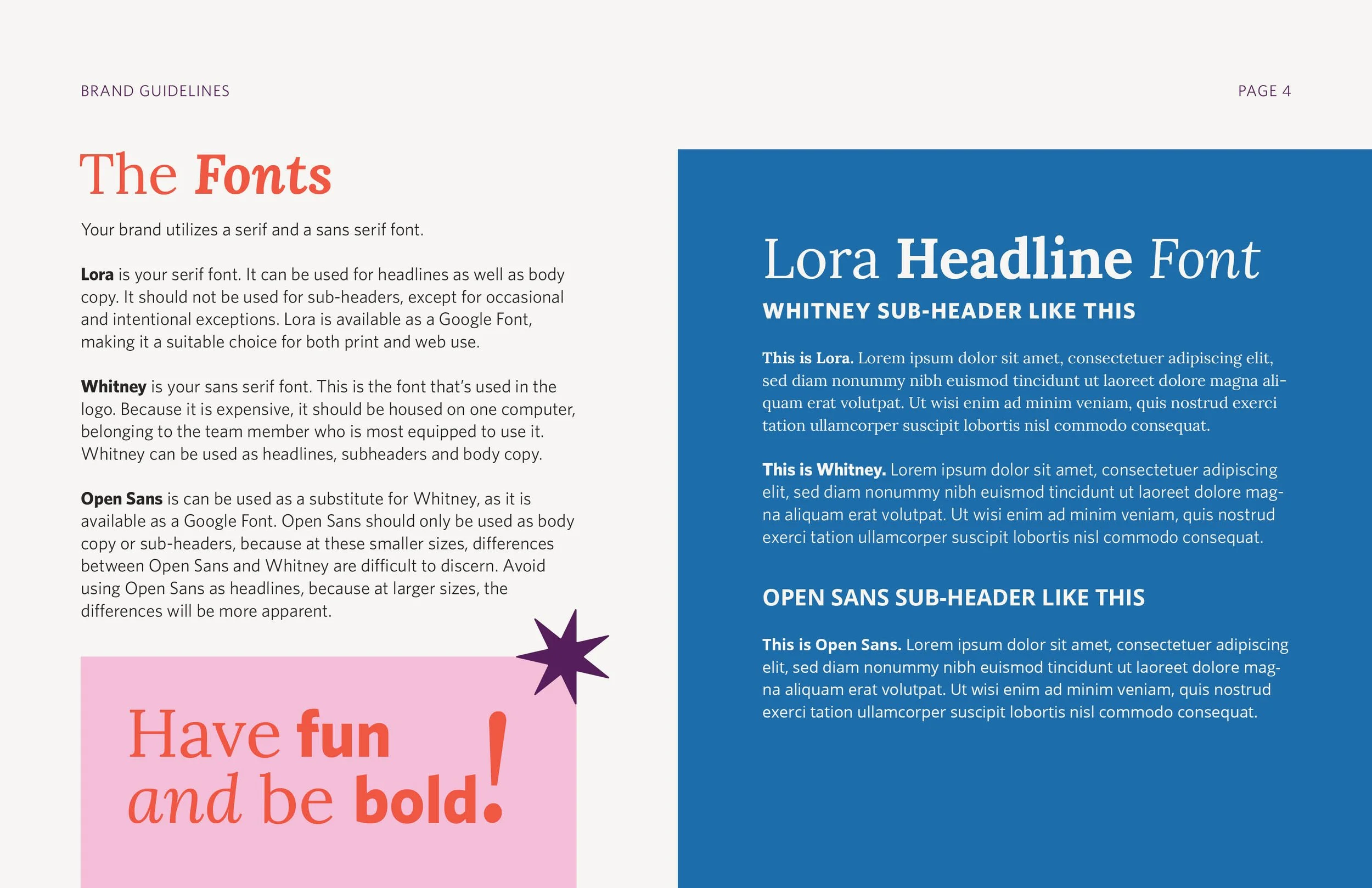
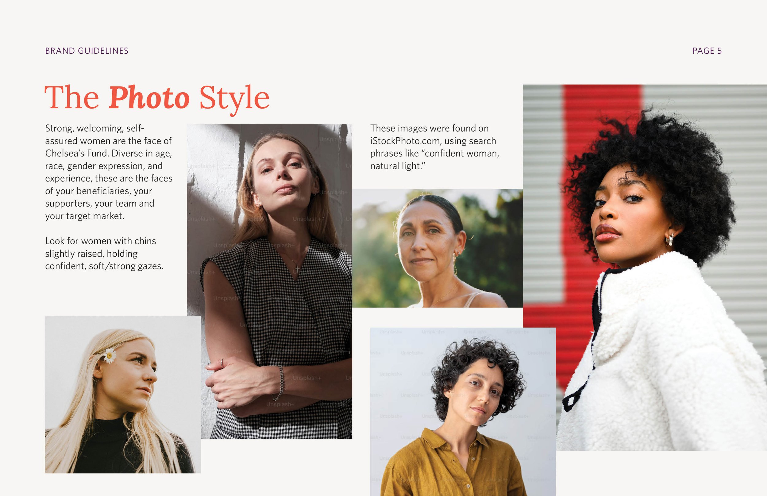
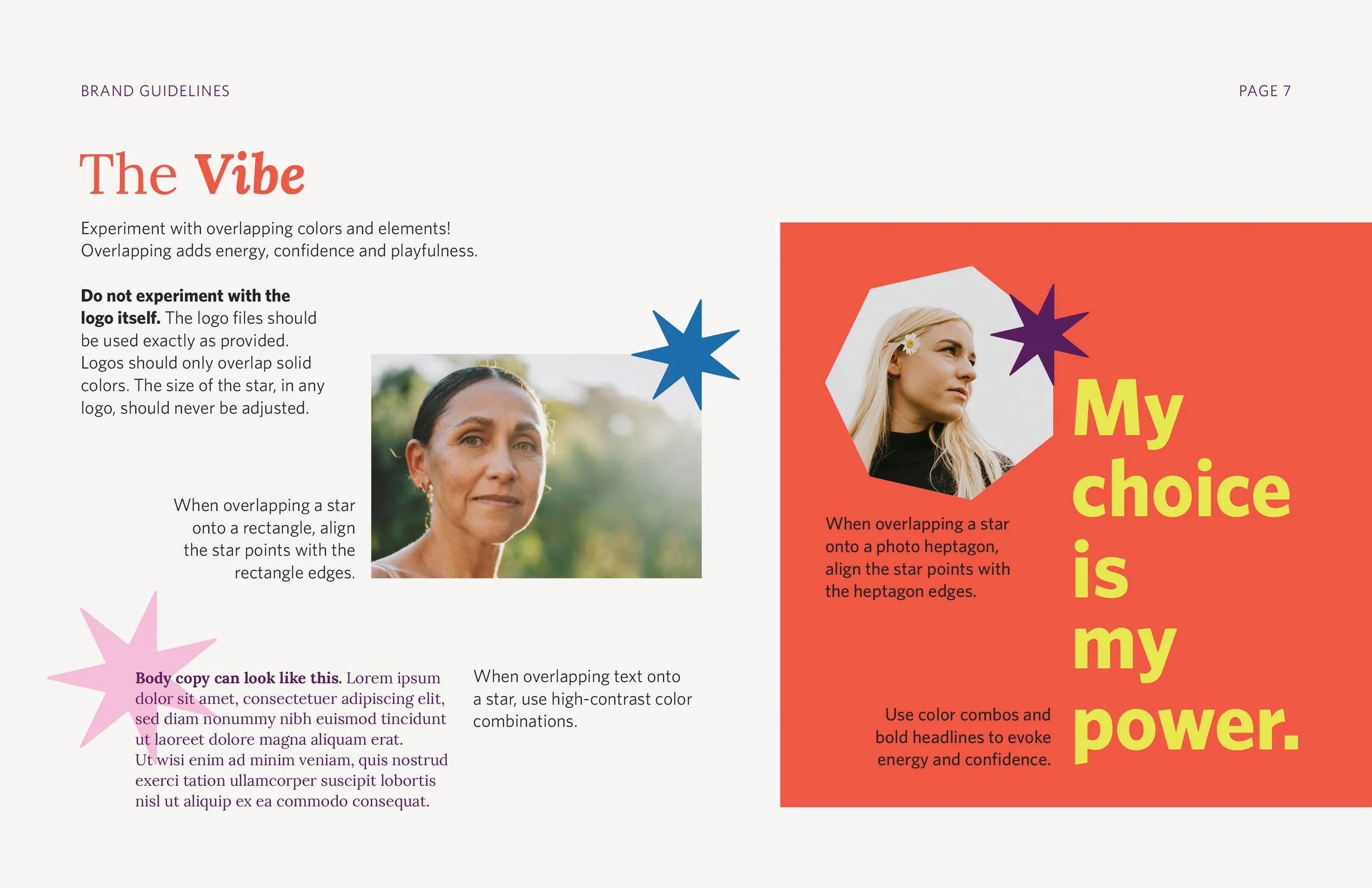
Shown here is their Brand Guidelines, which they used to redesign their website and social media.
Client: Chelsea’s Fund via Coepto Studio
