I ❤️ OHm.
I first learned about Oregon Humanities while working at Studio Jelly, as I familiarized myself with their portfolio of work. This was back in 2015, when I was on the cusp of both significant personal and professional growth—a real becoming into myself. The core of OHm—social, cultural and philosophical perspectives—spoke to where I was at the time, and it’s continued to do so.
A few years later, I landed an incredible gig working with University of Portland on their thrice-yearly, 52-page alumni magazine, Portland. Jessica Murphy Moo was at the helm as editor, and I took the lead on design. As of today, I’ve designed and art directed seven issues. The relationship I have with the editor and the alignment I have with the content have given me one of the most fulfilling professional highs of my career. And the real bonus of that project is that I learned that I have a deep love of editorial work—it’s provided a pivot point for my career, shaping the kind of opportunities I pursue.
Also in these past few years, I’ve been able to meet and befriend Jen Wick, who I’ve long admired. Jen gave me some pointers on how to work with illustrators and photographers as I got my feet under me at UP, and she’s continued to serve as a close friend and mentor. Her enthusiasm for Oregon Humanities is infectious, and I’d love to carry it on in her stead.
I was able to attend one OHm event before COVID hit—the Think & Drink with Desmond Meade (nice job on the name change for that event, by the way). Racial equity and criminal justice reform are high on my list of personal passions, and I gained a lot from being part of the audience that night. Your work at OHm is so important to our local environment—you bring issues to the eyes of folks in a way that makes room for new ideas, new ways of seeing, new solutions, and I find what you do to be such a unifying service to the state and region.
I’ve included samples of my editorial work below. Using a visual language to engage readers is such a thrill for me—editorial projects give me the bandwidth to think broadly about a topic, and then focus on an aspect that will speak to readers in an intentional way.
If you explore the rest of my site, you’ll see that I’m committed to clients that are equitable, sustainable, community-oriented and future-minded. I’m so fortunate to work on projects that make the world a better place to live.
I really appreciate your place in our community, and I’d be honored to support you as Art Director of Oregon Humanities Magazine.

PUBLICATIONS EXPERIENCE
University of Portland’s Portland magazine—Art Director and Designer
Work with editor to establish theme and cover concept of each issue.
Identify potential photographers and illustrators, secure fee and manage invoicing. Art direction of all contract artists. Provide sketches, attend photo shoots, etc., as necessary.
Concept and design of 5–7 features per issue, ranging from 2–10 pages each.
Design front-of-book (campus news) and back-of-book (alumni updates) for each issue.
Review extensive color studies, do a final read-through, prep files for production and attend press checks at Bridgetown Printing on Swan Island.
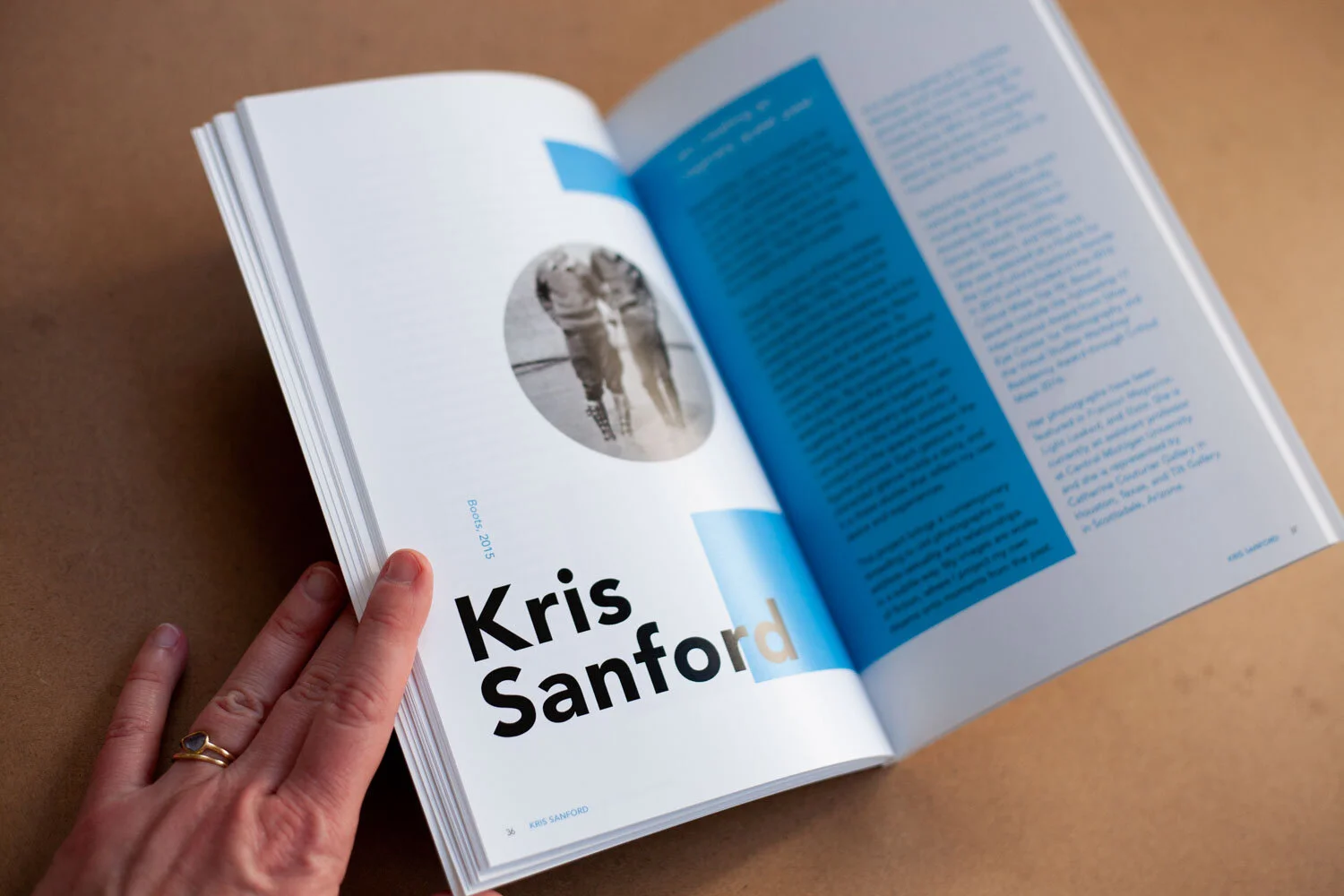
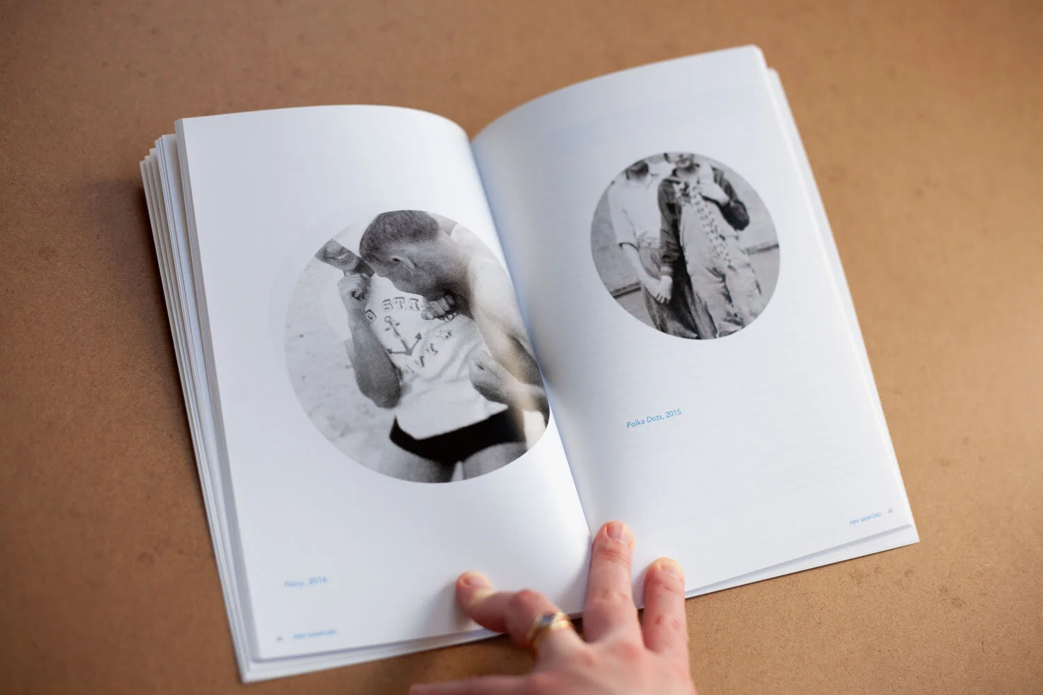
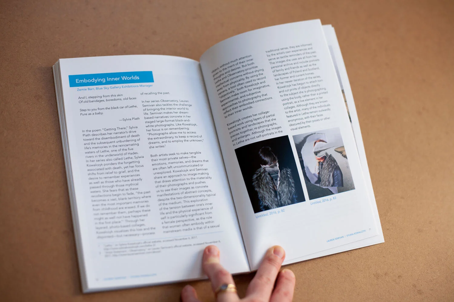
Blue Sky Gallery exhibition catalogs—Designer
2019: 144-page, perfect bound book, including three fold-out pages for extra-wide imagery. Executed full design of book and managed printing at Brown Printing in Portland.
2017: 84-page, perfect bound book. Executed full design of book and managed printing at Brown Printing in Portland.
OTHER EXPERIENCE AND INTERESTS
Designed 50th anniversary fundraiser for Oregon Environmental Council in 2018, featuring a 16-page ‘zine invitation.
Freelance designer with Mercy Corps since 2013, designing everything from 50+ page reports to infographics to billboards to their interactive education center.
Contract designer for Kaiser+Path, an architecture and development firm working with sustainable cross-laminated timber.
Currently pursuing a Post-Bacc degree in Art History from Portland State.
If ever you can’t find me, look in the little structure near Zig Zag Bridge at Portland Japanese Gardens. I’m probably sitting there with my eyes closed.
RATE PER ISSUE
Let’s talk! I’d love to have a conversation with your team regarding timing, templates, needs and expectations, before providing a hard quote.
Portfolio
Below are some samples from Portland magazine and Blue Sky’s exhibition catalogs.
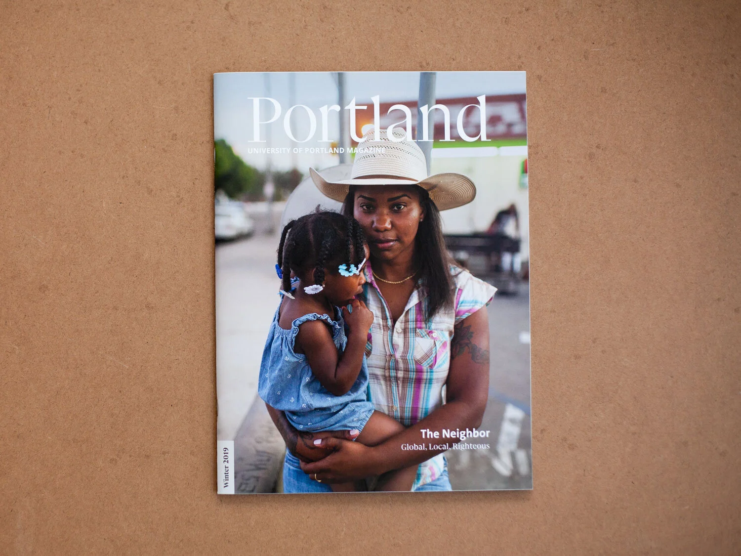
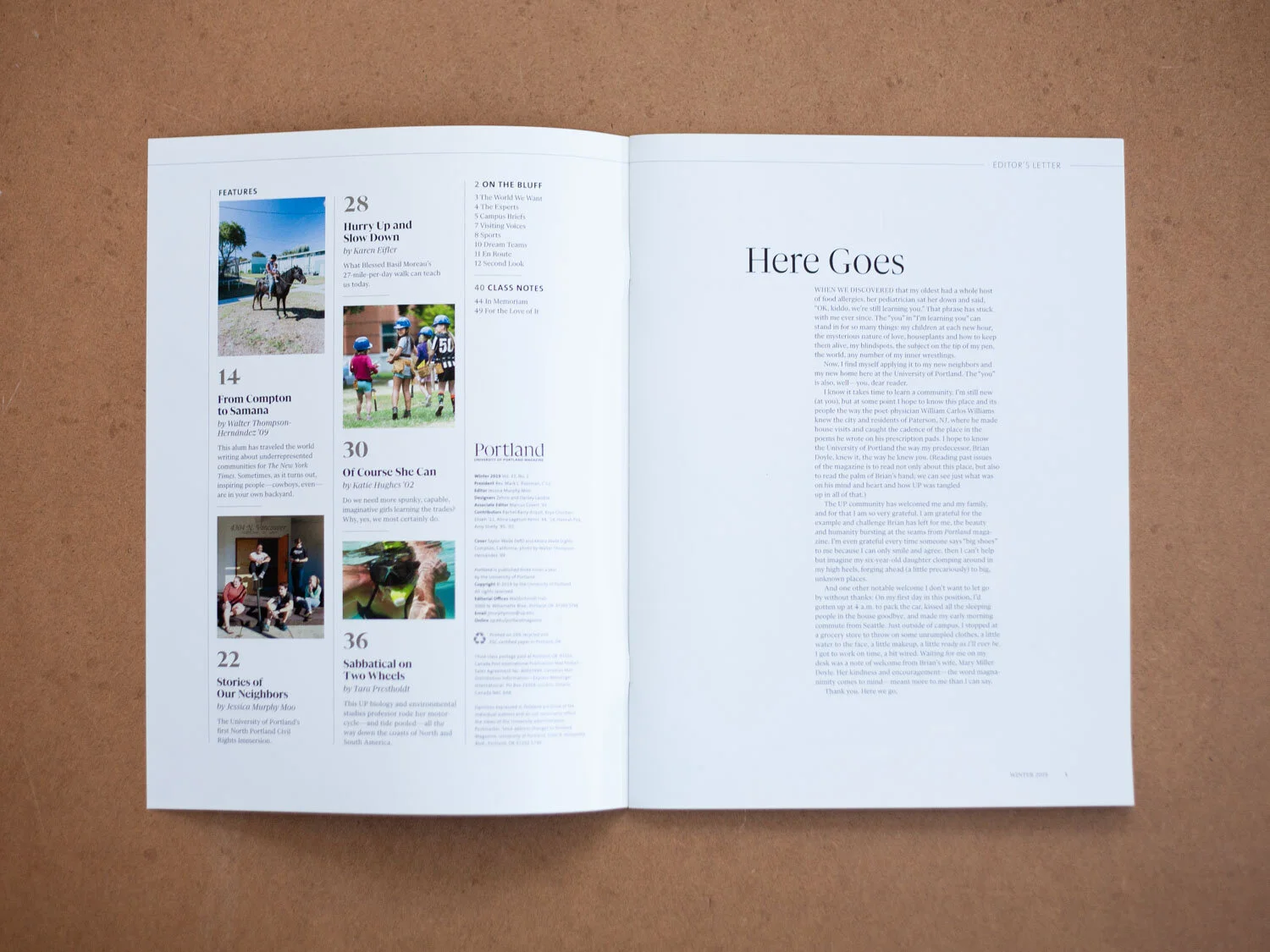
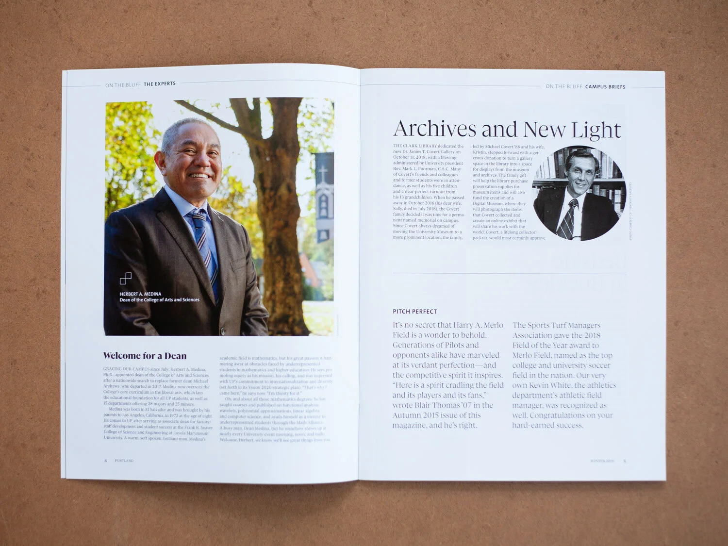
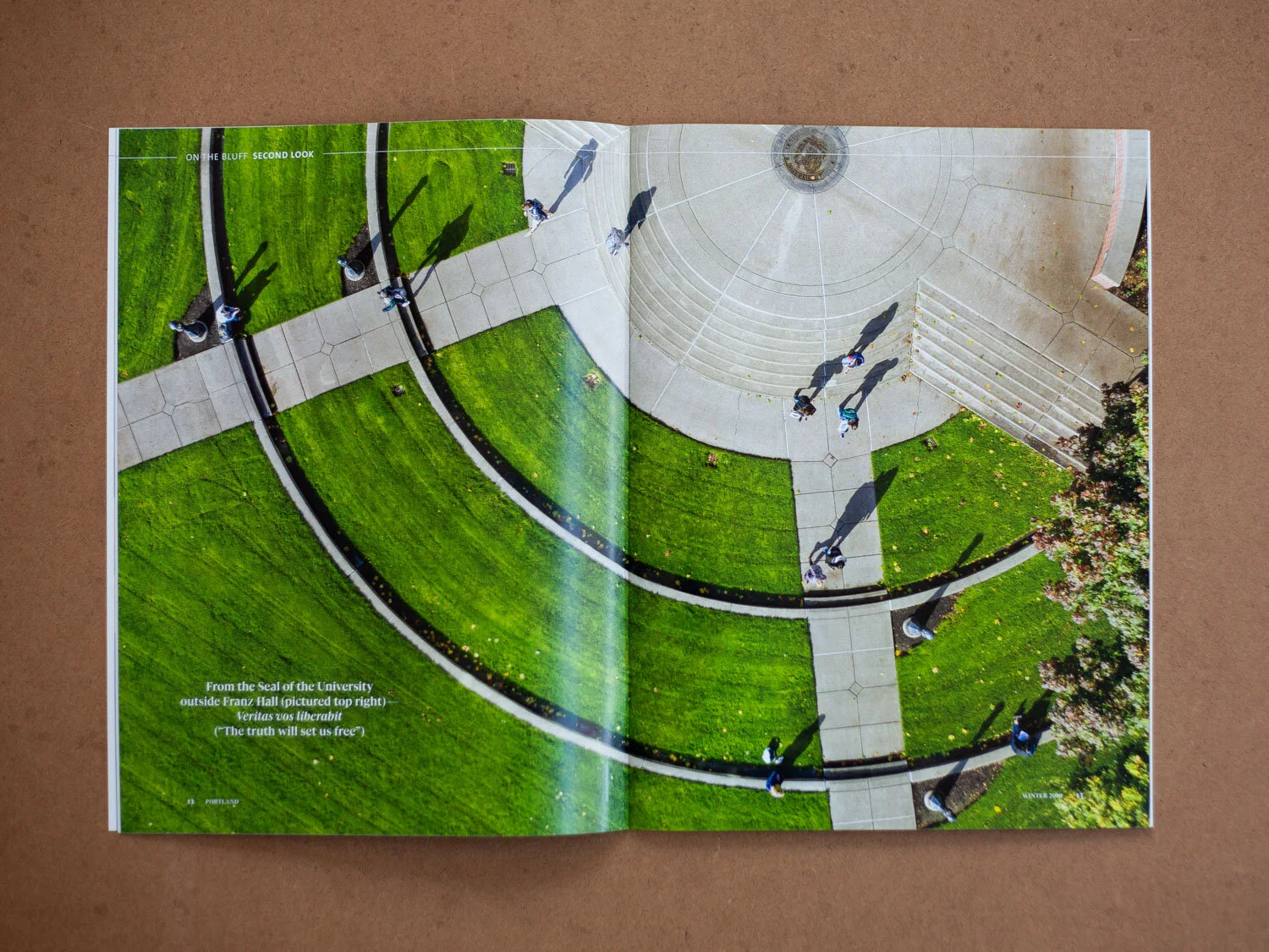
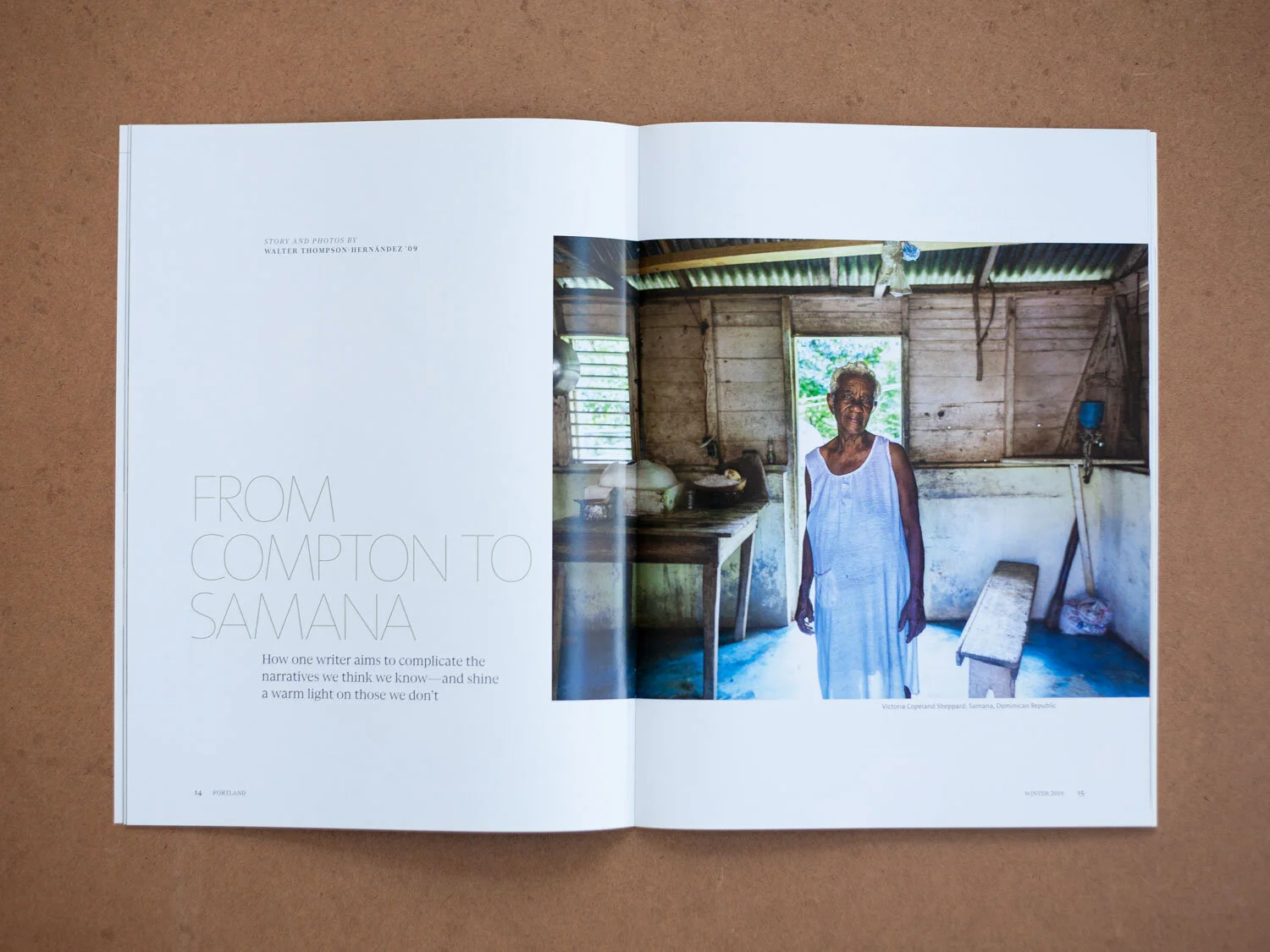
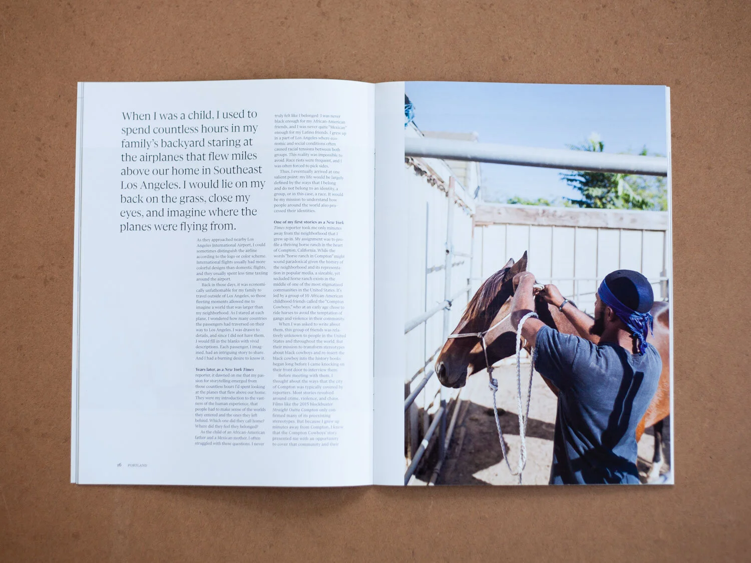
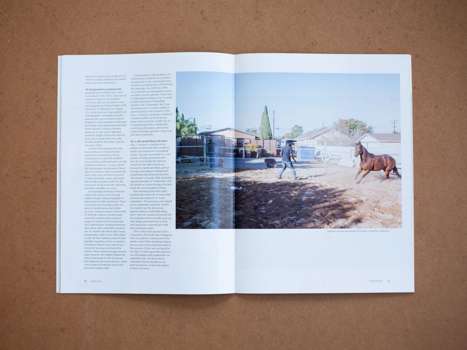
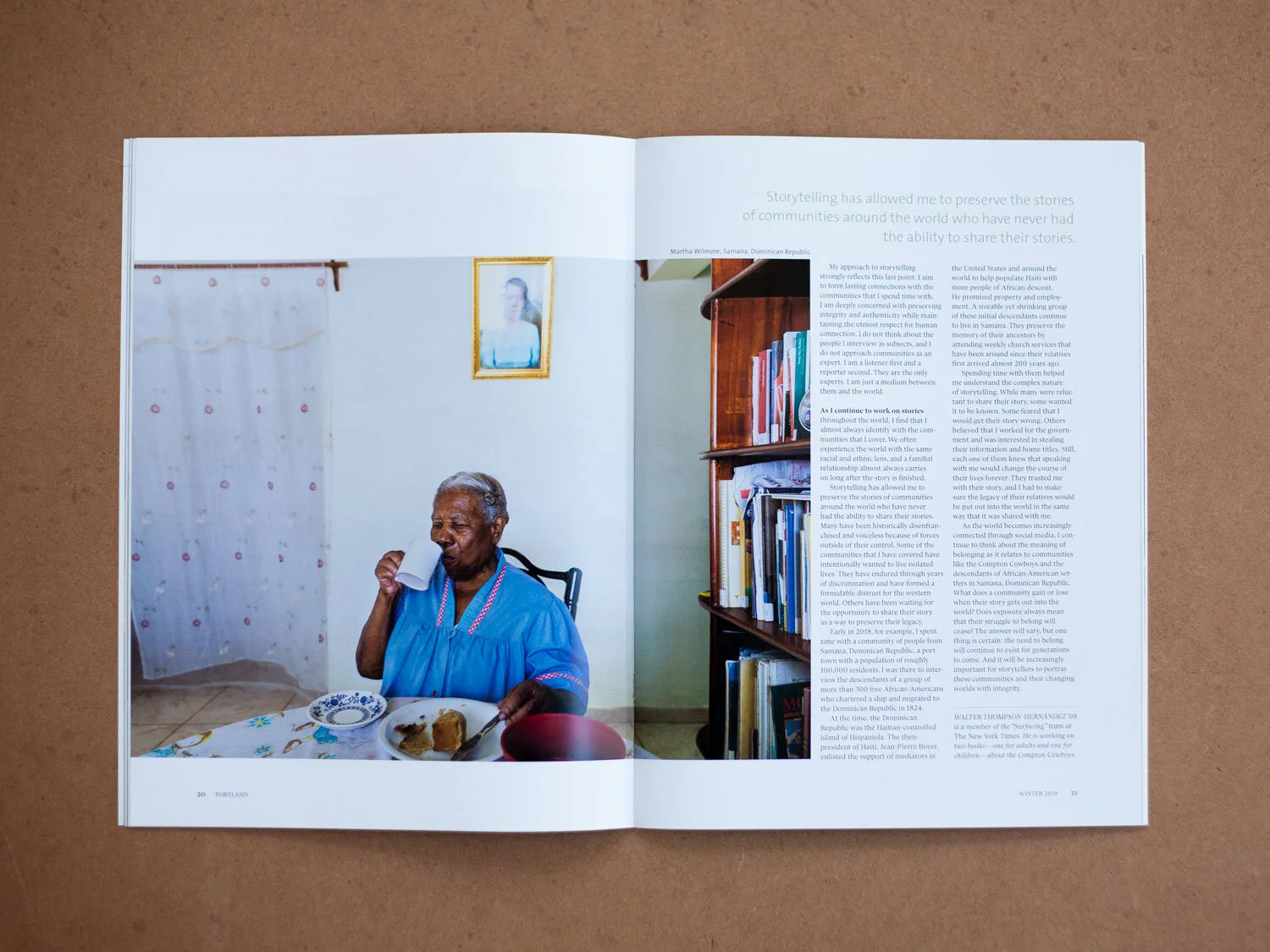
Portland Winter 2019
For our first issue, I fleshed out the 14-page template from Zehno, solving for iron-clad details like the table of contents, page numbers, headers, and baseline grid, to create a firm foundation for future issues.
Shown here are some of the front pages, and the lead story, a photo essay by UP alum Walter Thompson-Hernandez.
This issue was awarded a Silver Circle of Excellence award by CASE, The Council for Advancement and Support of Education.
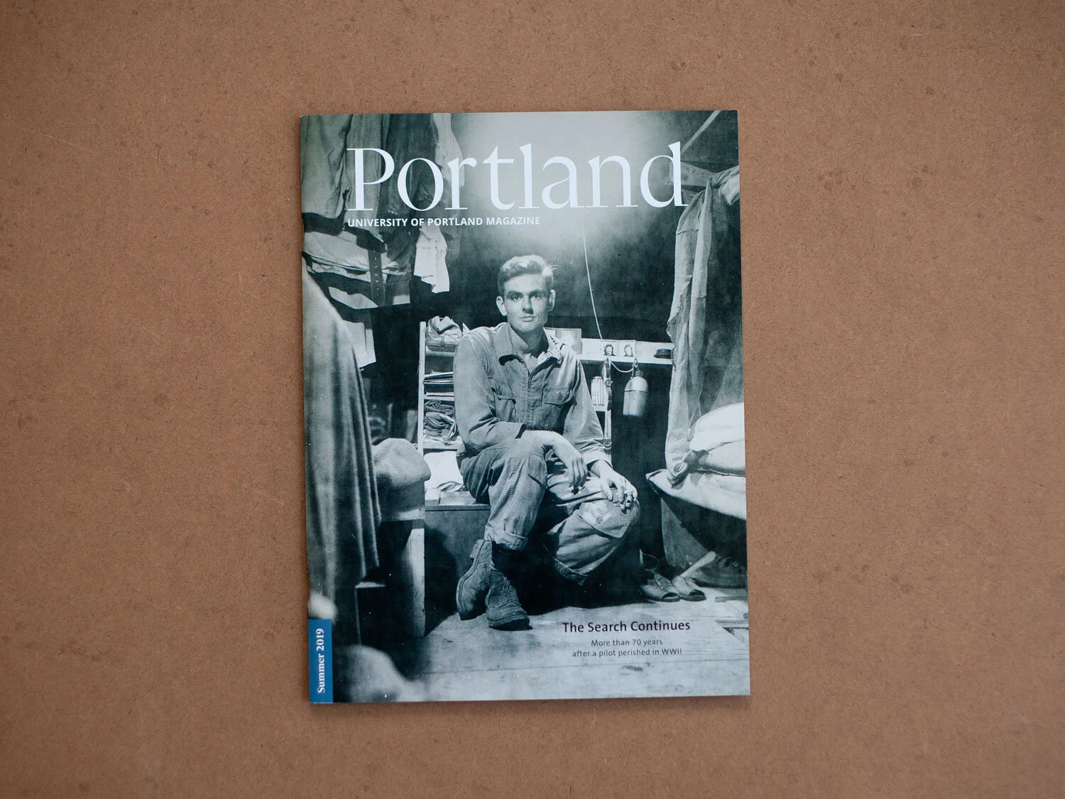
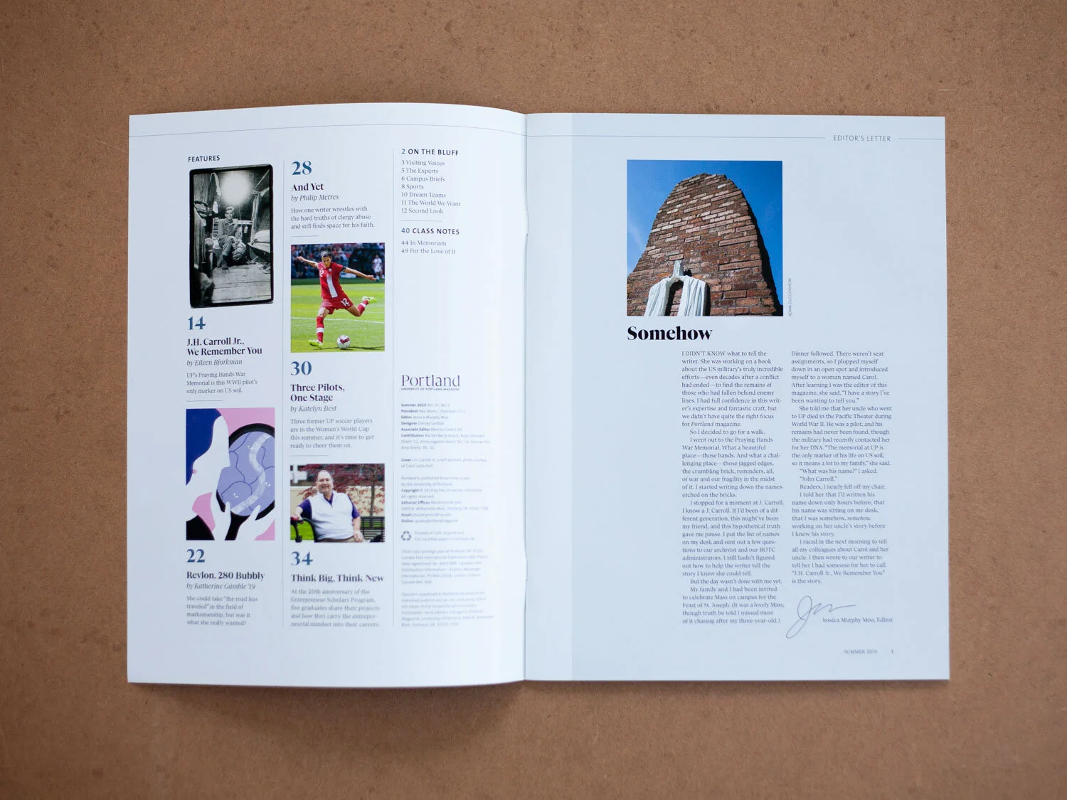
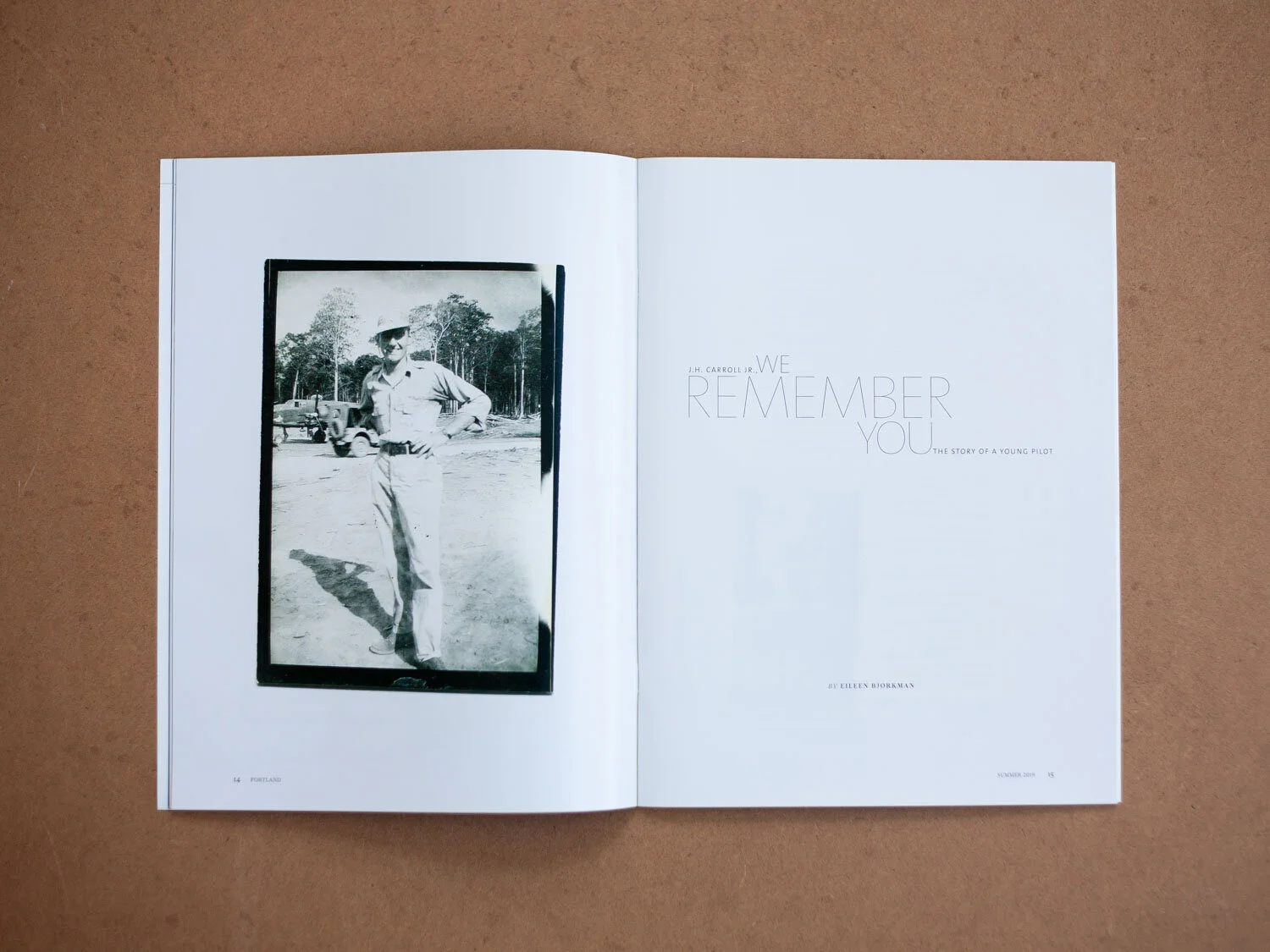
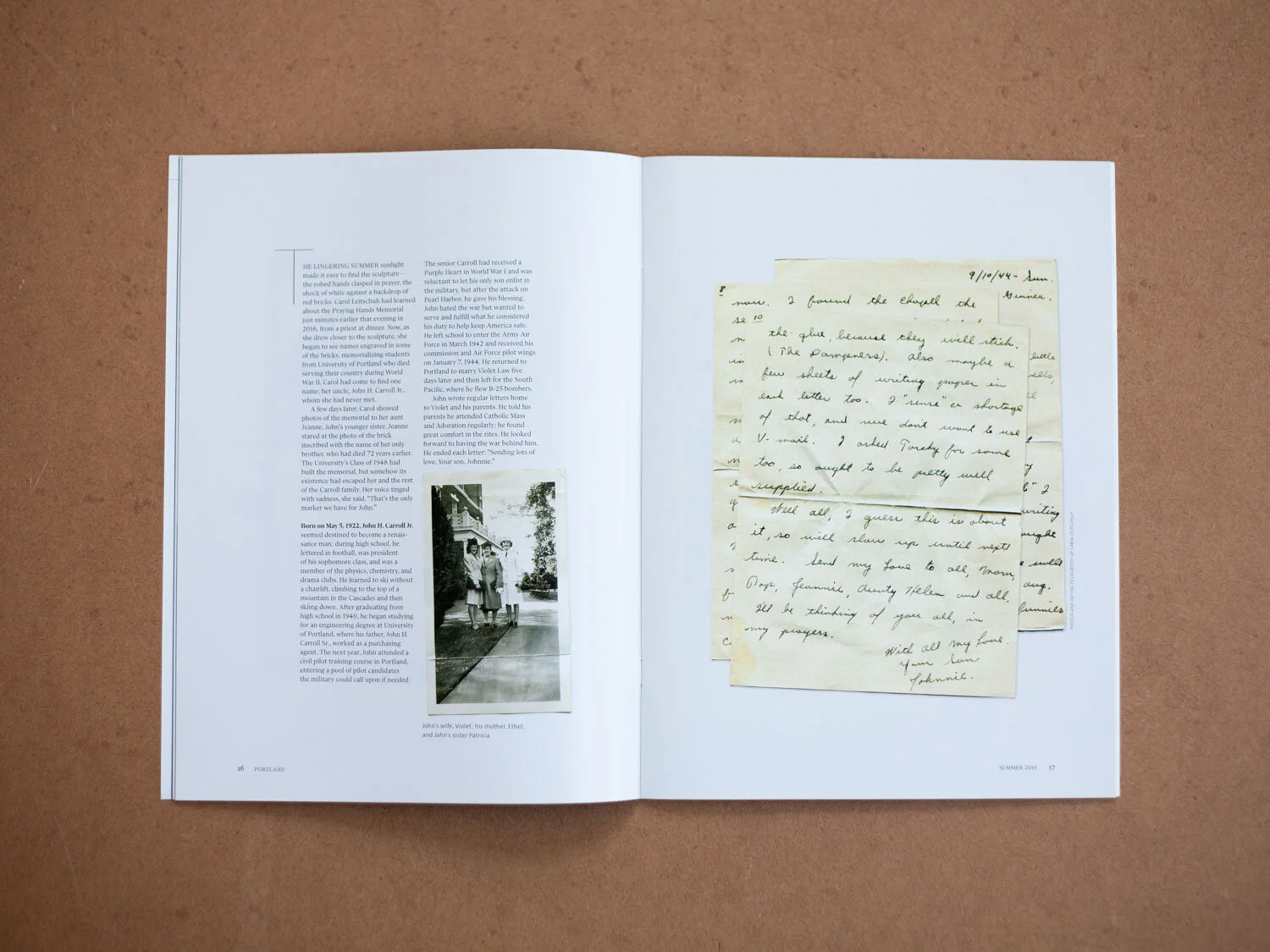
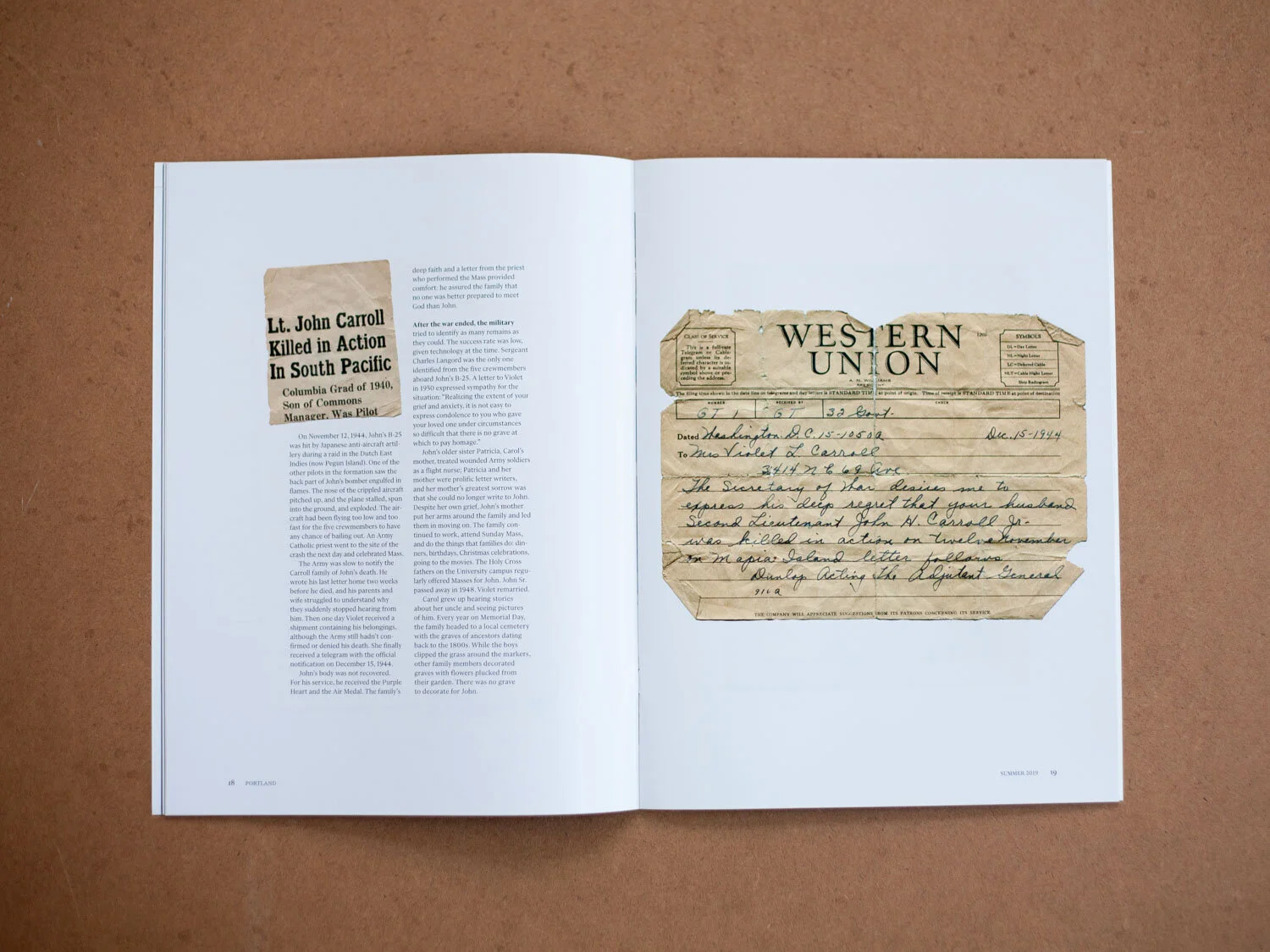
Portland Summer 2019
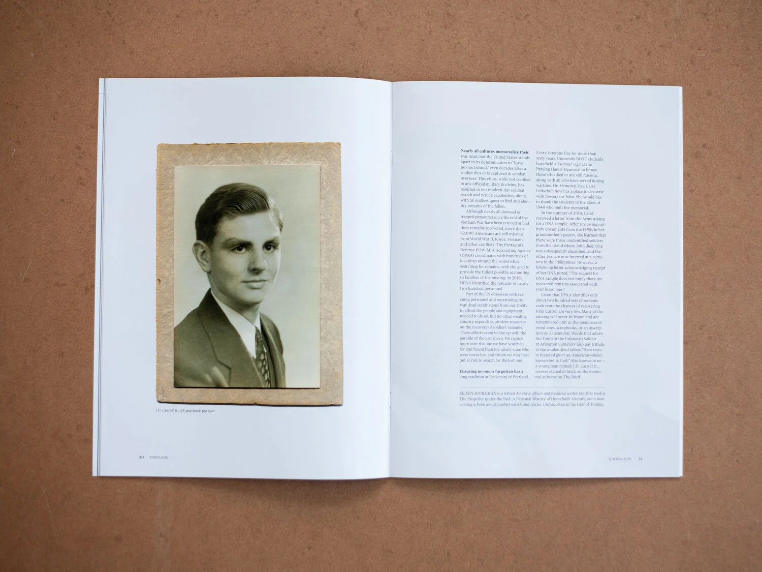
The cover story for our second issue took advantage of family photos and news clippings of J.H. Carroll, Jr., a UP alum who perished in WWII. This story came together when Jessica had a chance meeting with Carroll’s relative, just after talking with a writer about the US military’s dedication to finding fallen soldiers, even decades after their disappearance.
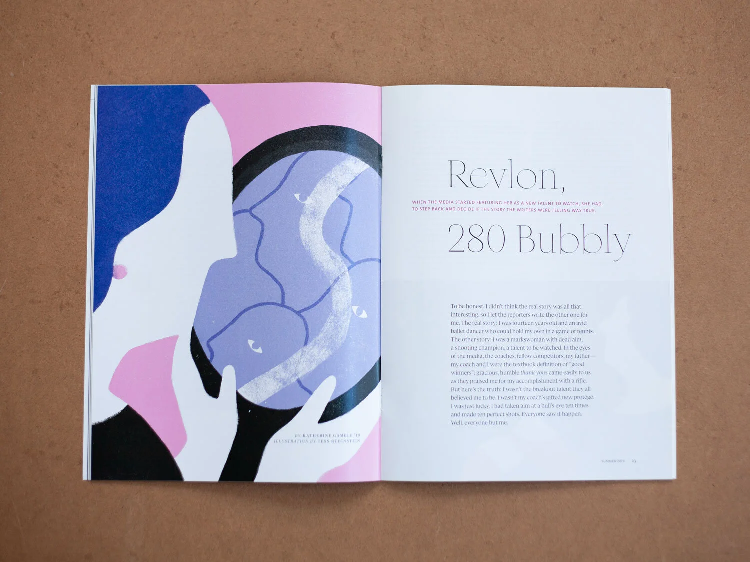
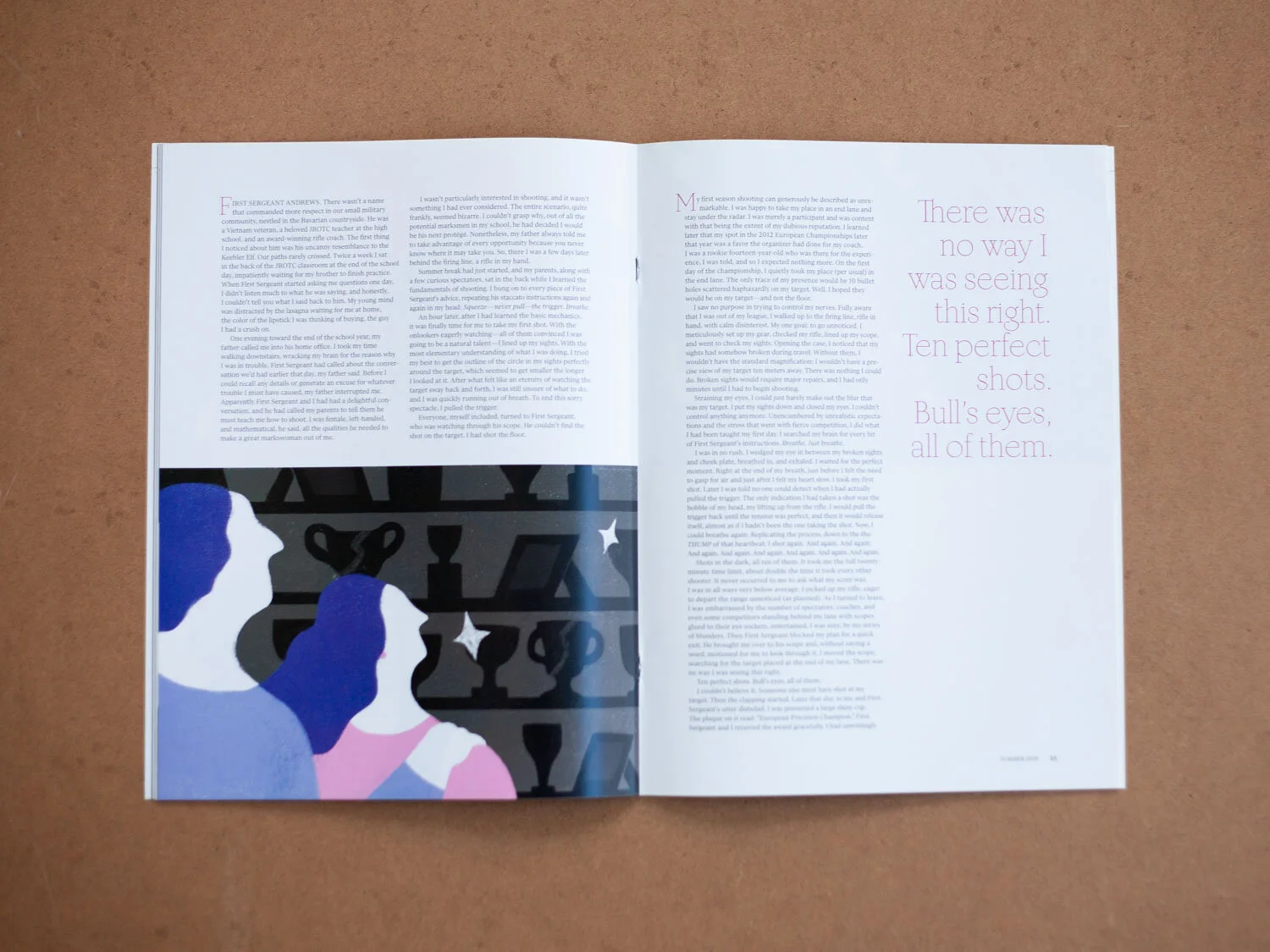
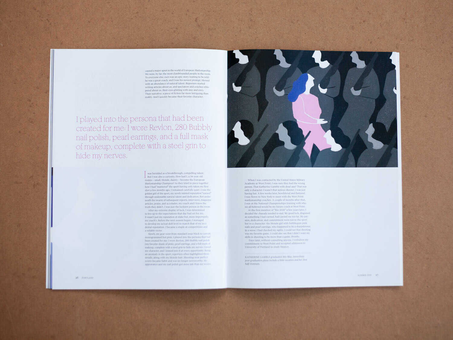
The Summer 2019 issue featured our first original illustrations. I worked with Tess Rubinstein to create three pieces to convey a young woman’s sorting through her identity—was she a potential Olympian markswoman, like everyone wanted her to be, or would she go her own way?
Portland Fall 2019
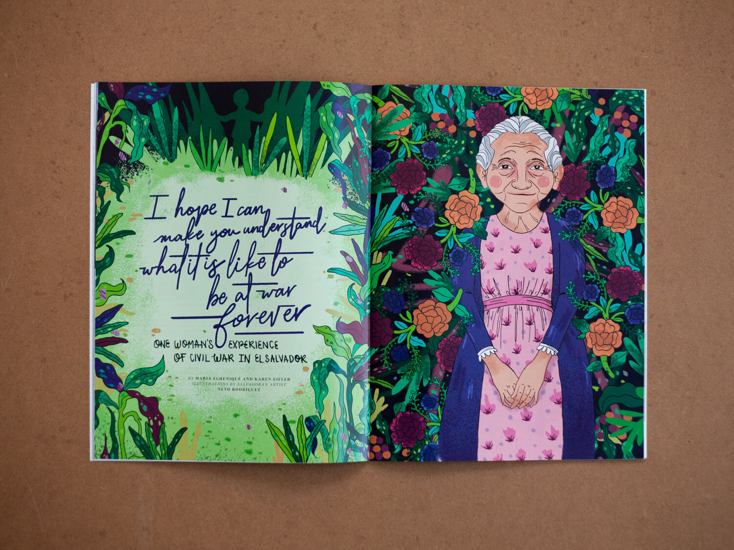
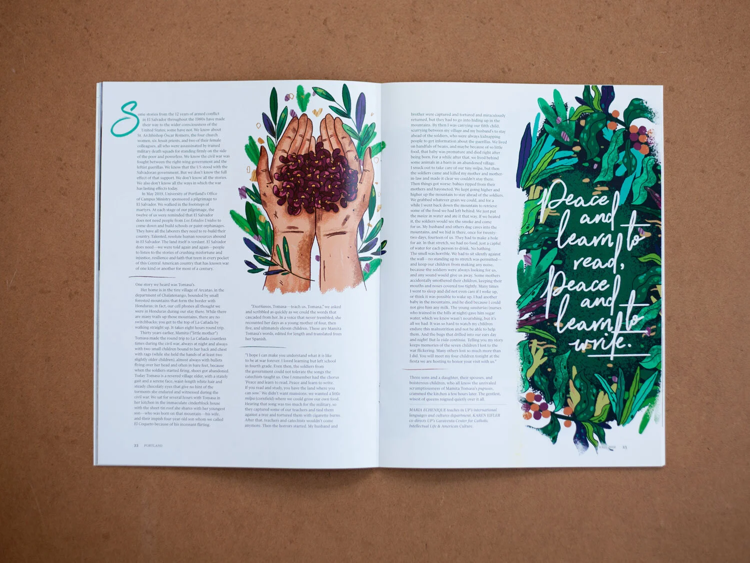
Potentially my favorite art direction experience was working with Salvadoran illustrator Neto Rod, who I found on Instagram (thanks, hashtags!). We had a story about a woman who survived the Civil War there, so I took to the interwebs to find the perfect artist fit from El Salvador. Neto and I Skyped a few times to work on the piece, and the experience was pretty powerful and inspiring for both of us.
Neto’s work for the feature was so wondrous, so we asked him to create a cover image, as well. “When We Listen” illustrates a common theme for that issue’s features.

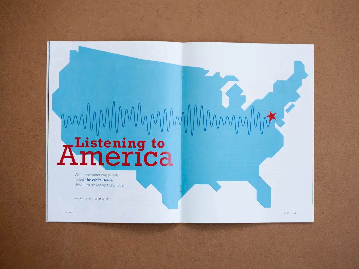
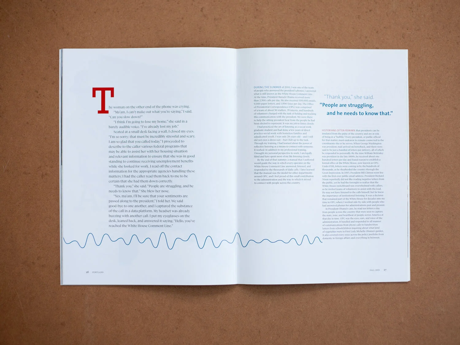
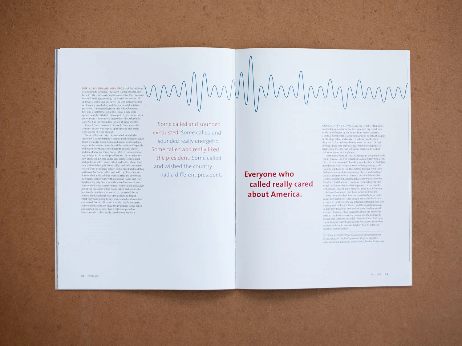
The Fall 2019 issue also included a short piece about an alum who answered phones at The White House during the Obama Administration. Without any photos or imagery, or the bandwidth for more original art, “Listening to America” is an example of my layout and design solutions when given a blank canvas.
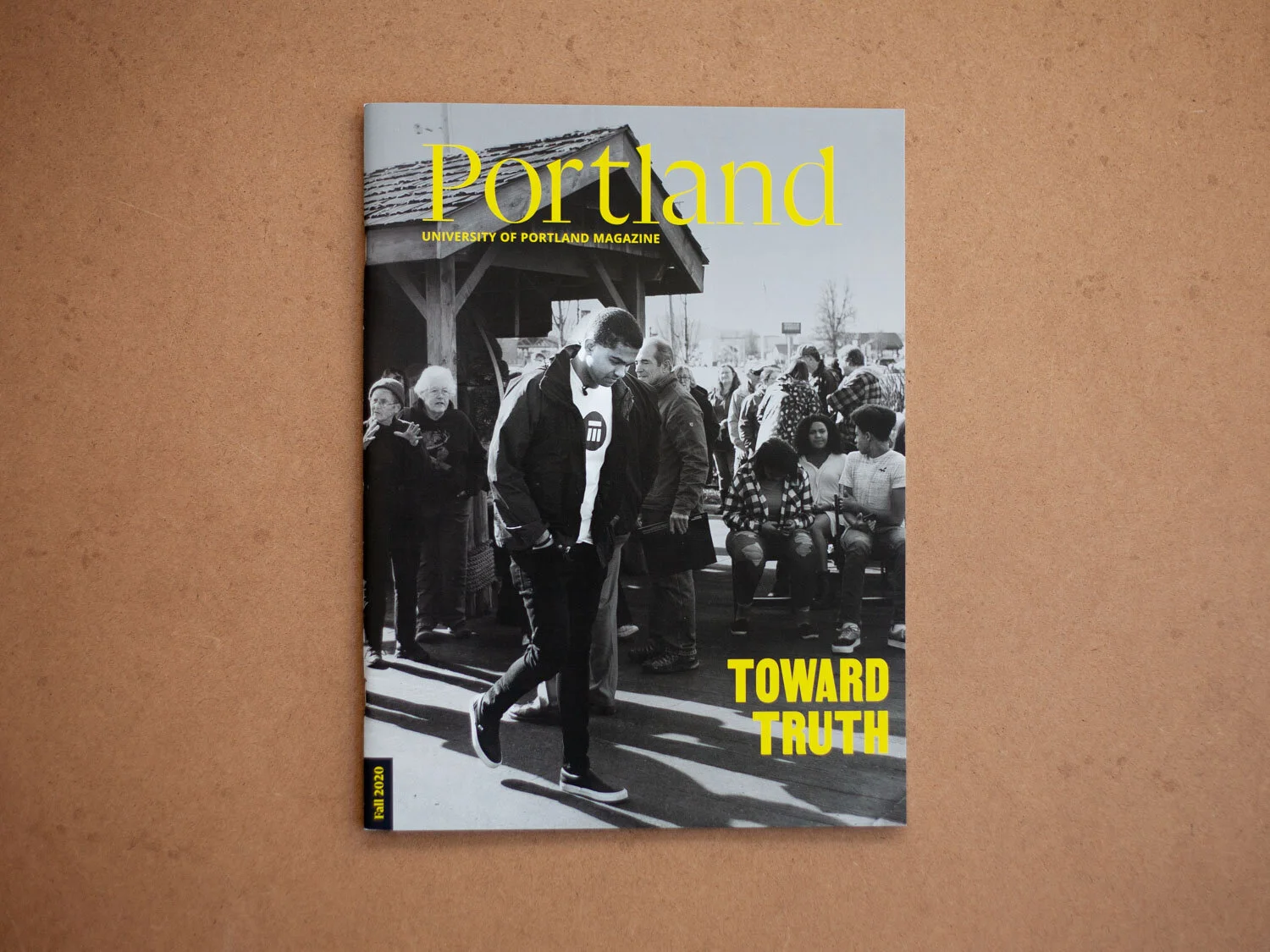
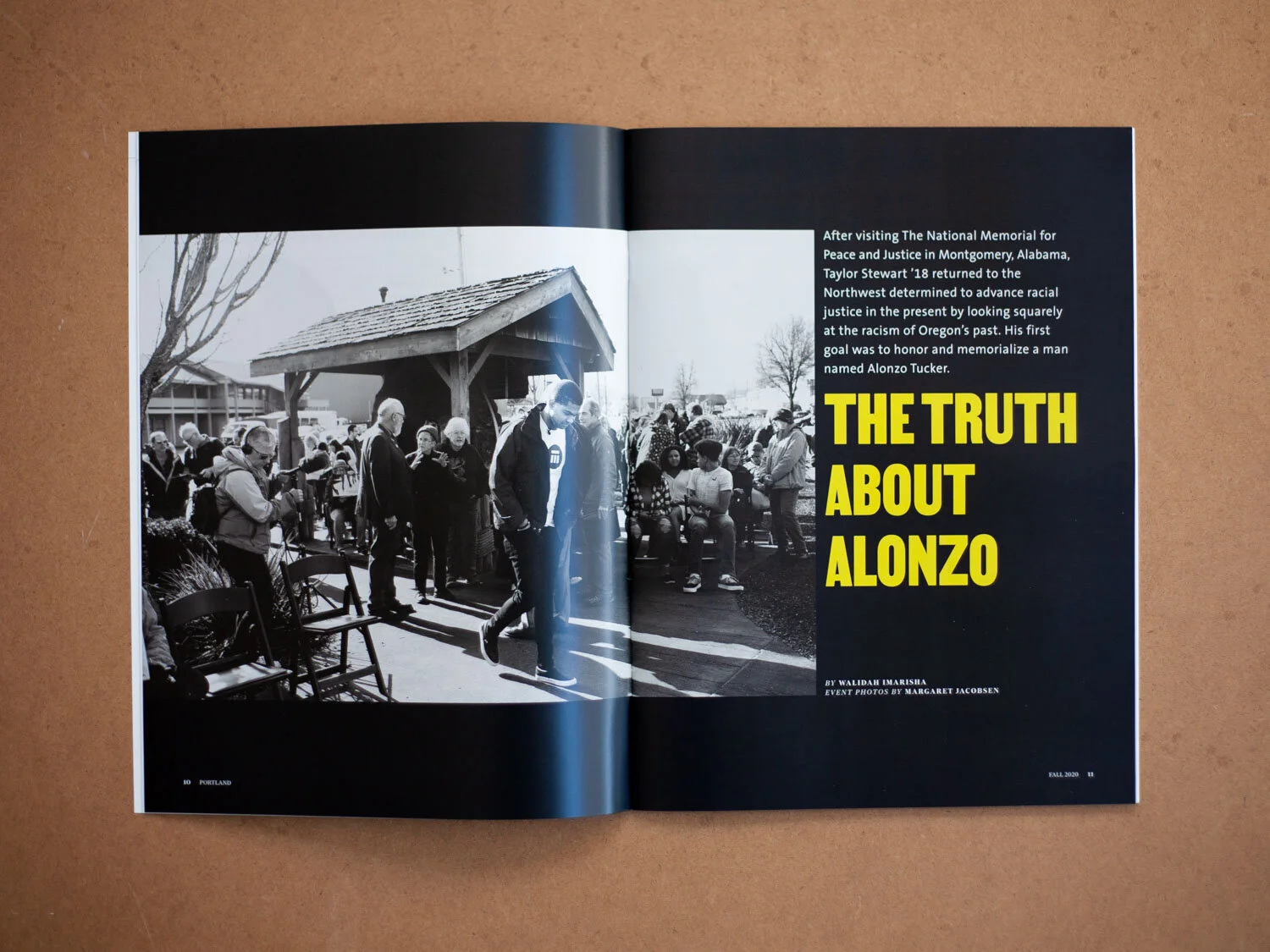
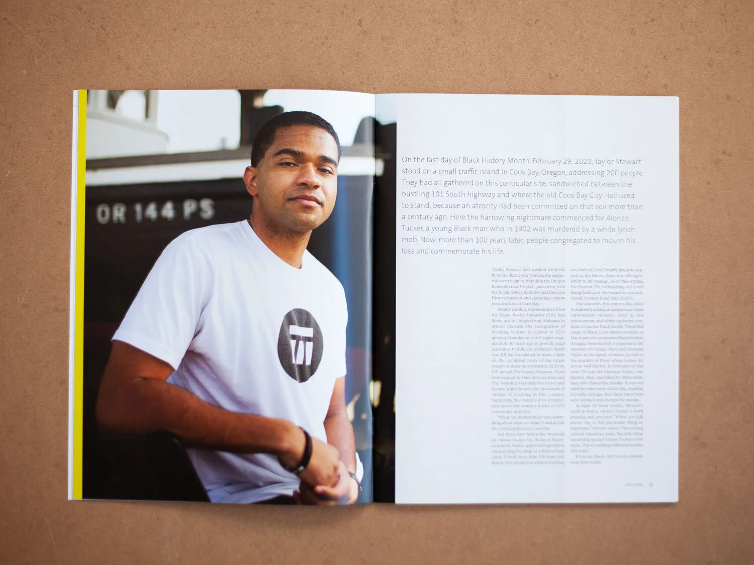
Portland Fall 2020
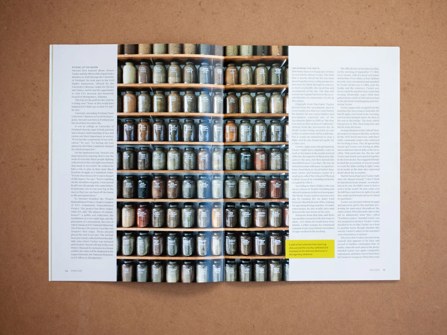
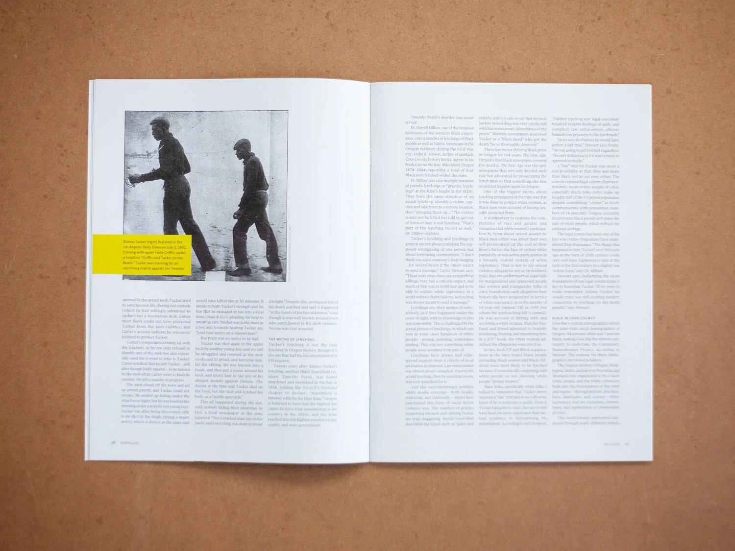
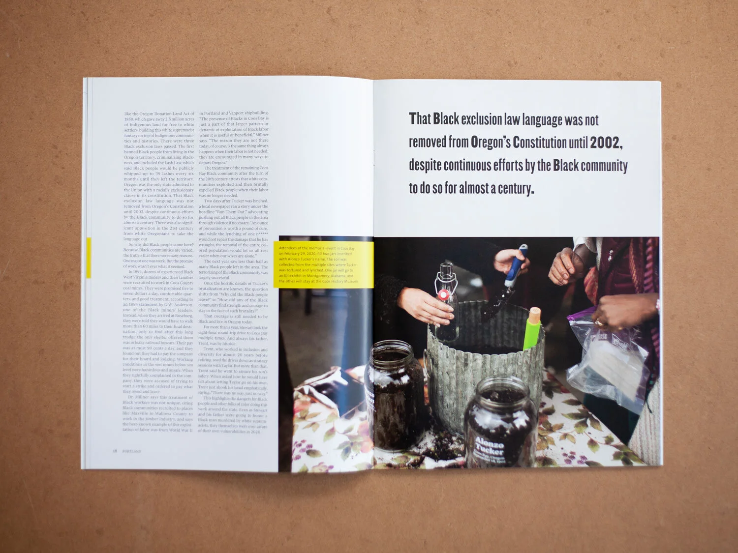
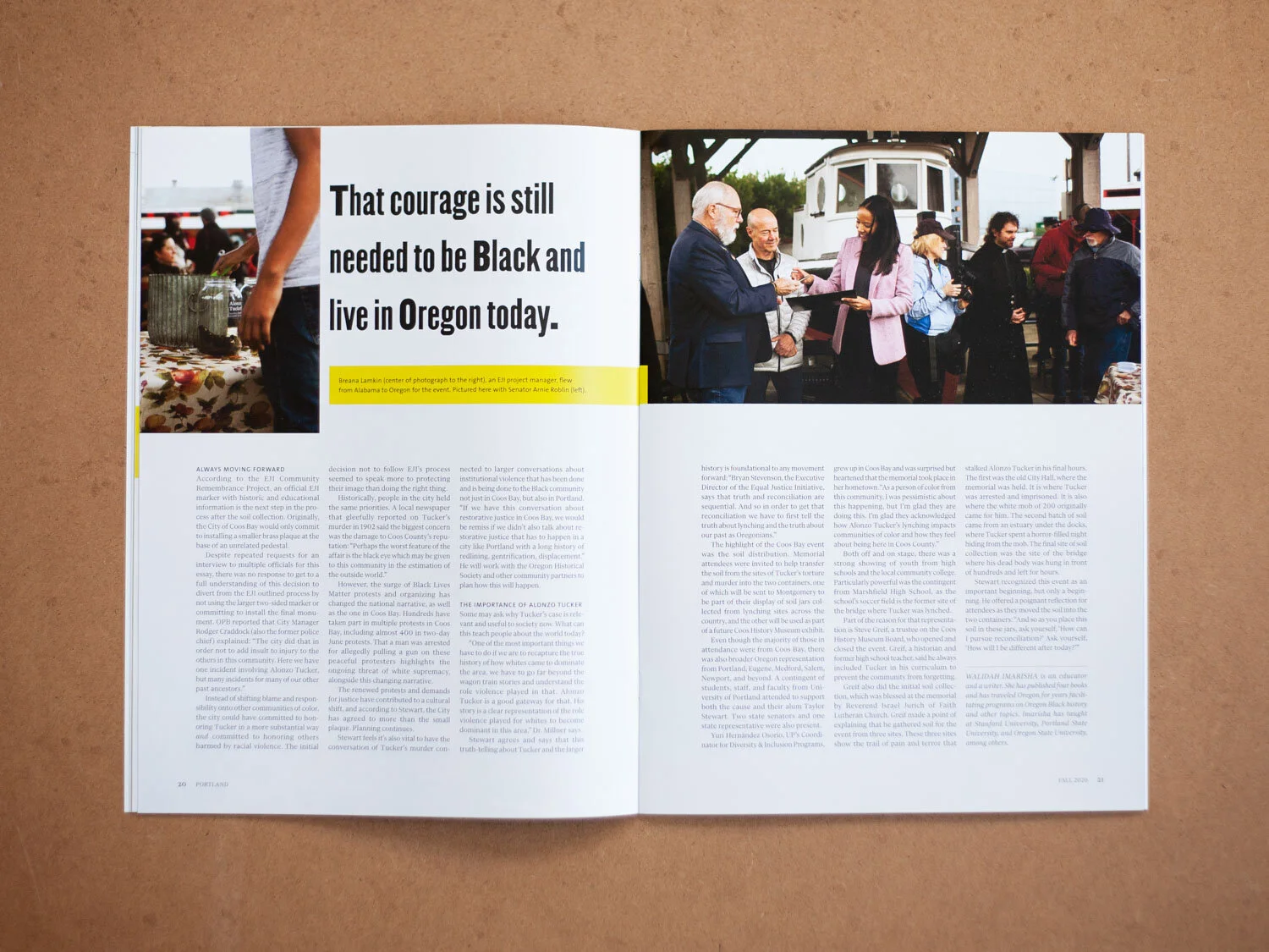
What a humbling experience to work on the story, “Toward Truth,” about recent graduate Taylor Stewart, who worked with Equal Justice Initiative (EJI) to memorialize Alonzo Tucker, the single recorded victim of lynching in the state of Oregon. Using a typeface inspired by the “I Am A Man” posters of the Civil Rights era, this feature came to life thanks to intimate imagery by Margaret Jacobsen, a bold accent color and vivid writing. I’d been fortunate enough to visit EJI in Montgomery the previous year, so the image of the wall of jars of soil from lynching site is one I was able to contribute.
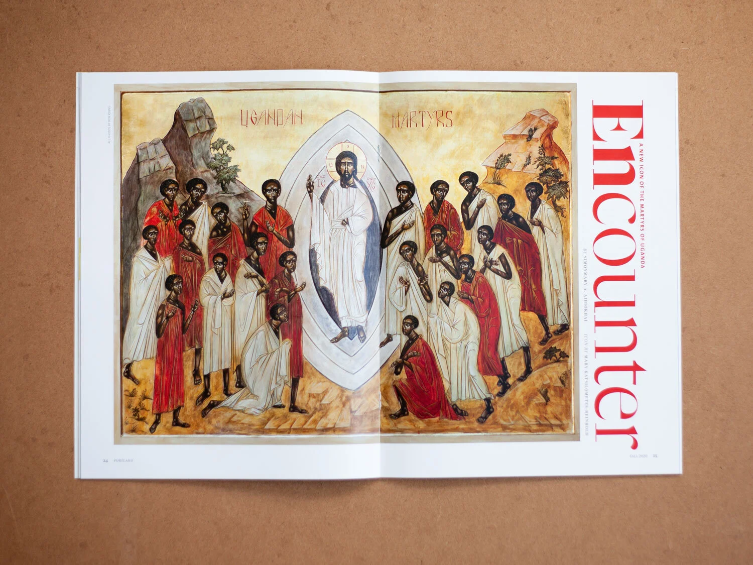
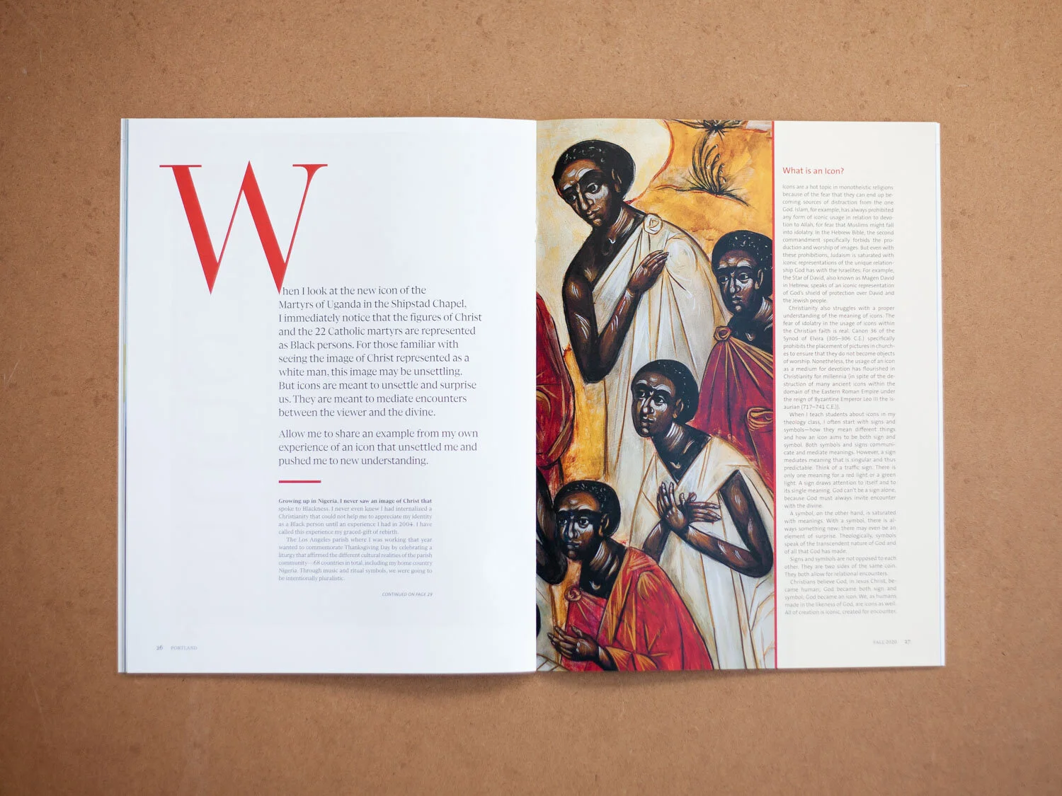
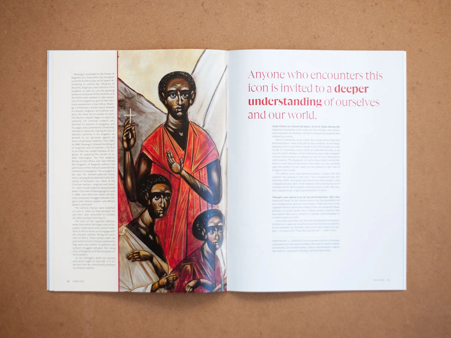
“Encounter” may be my favorite layout so far. The story required some lengthy sidebars to unpack the context, so I used close-ups of faces from the painting and strong pull quotes to direct the viewer’s eye to the main story, letting the sidebars support from the margins.

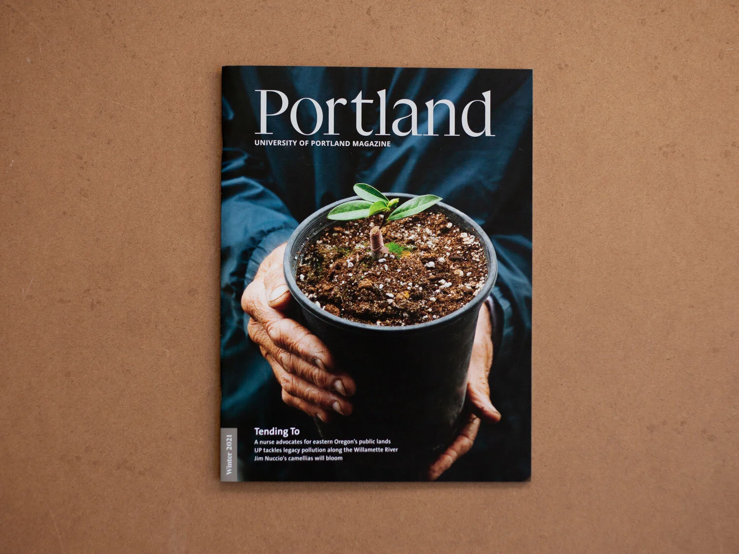
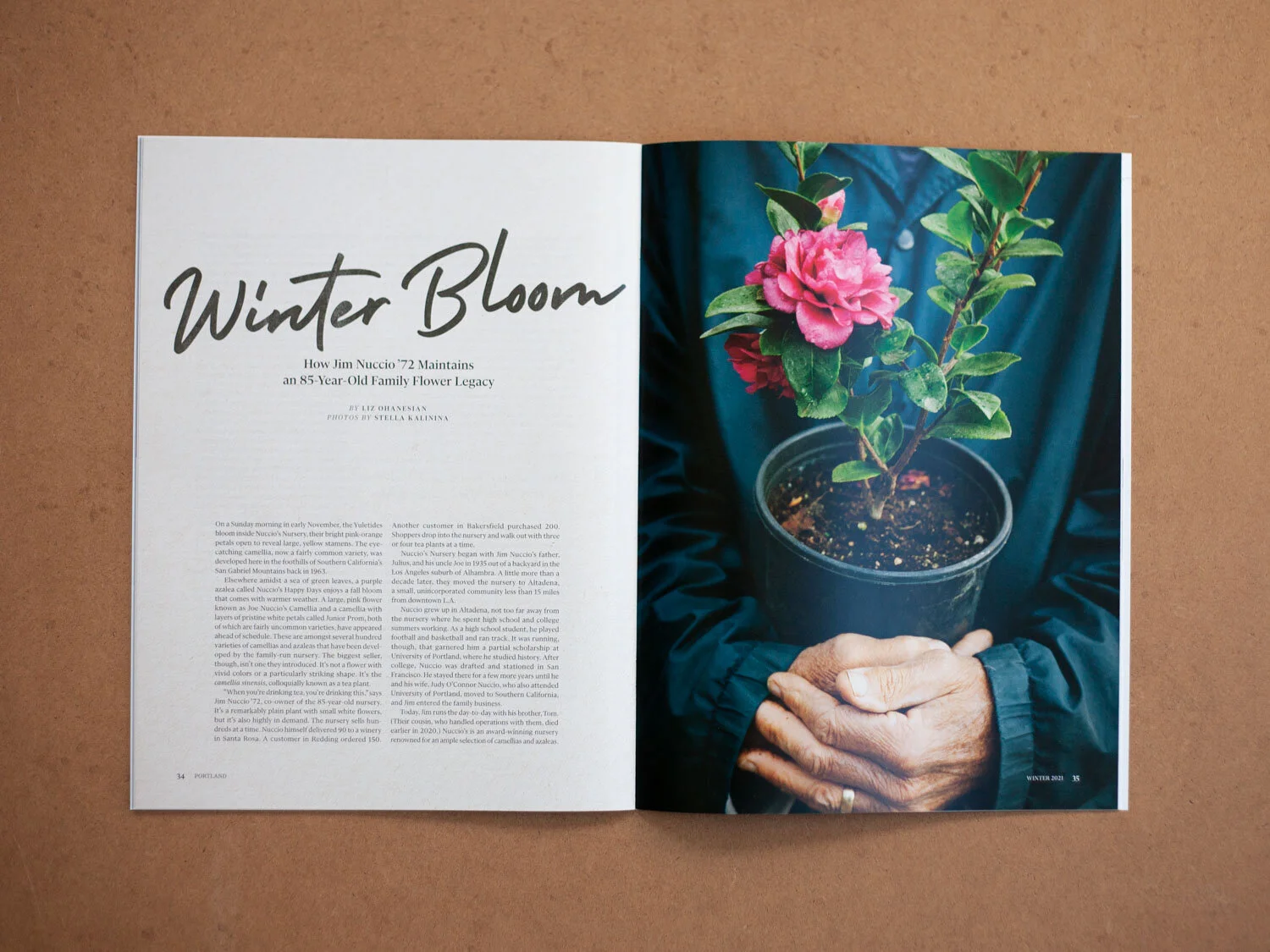
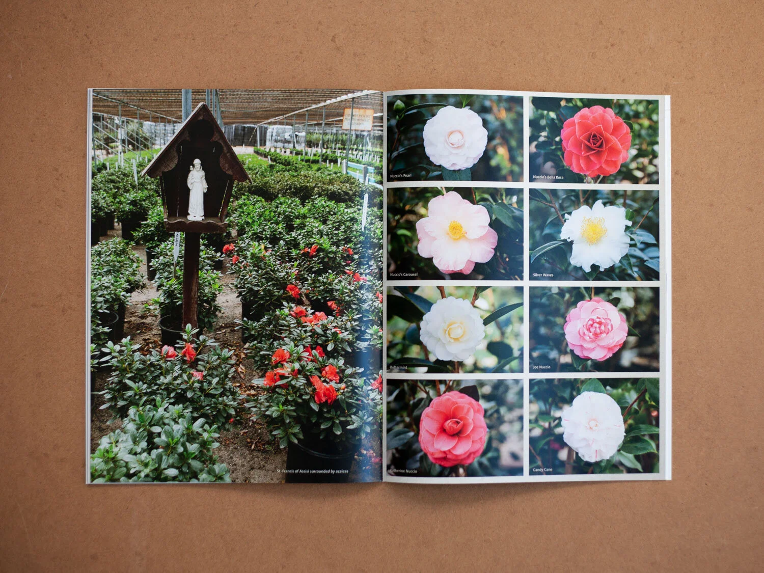
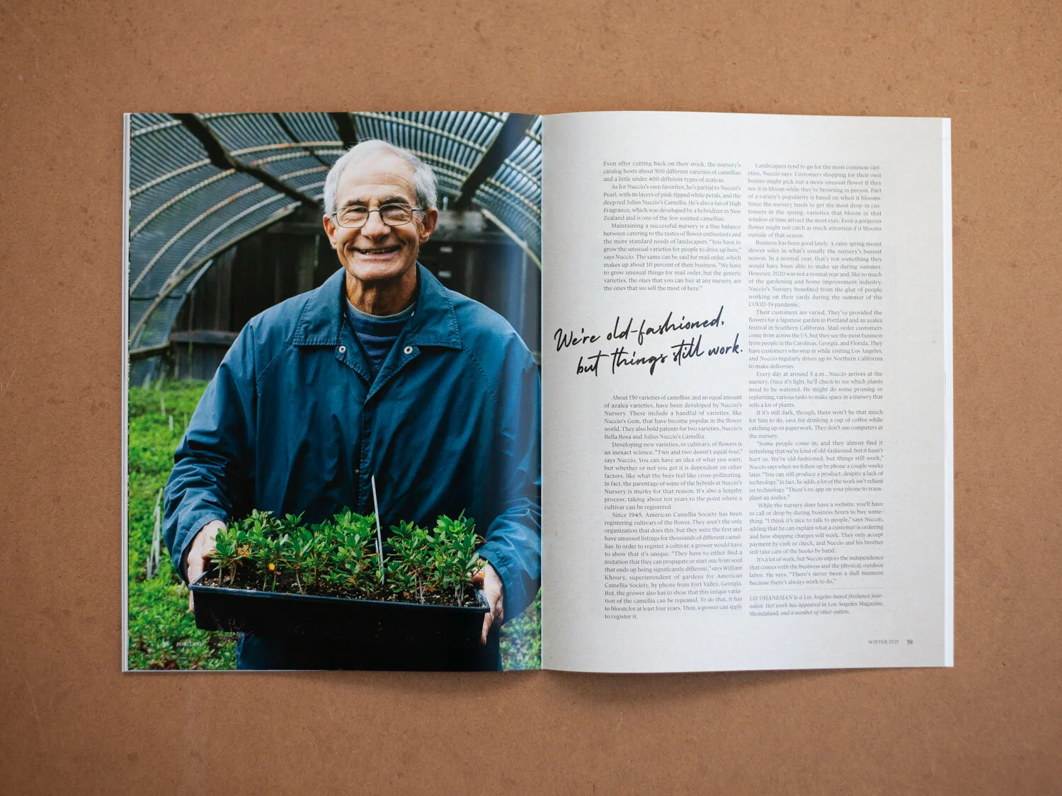
Portland Winter 2021
Our most recent issue celebrates a feel-good image of a camellia start, a visual parallel to the hope many of us feel as the immense weight of COVID slowly starts to ease. I used a textured paper background and some handwriting details to bring the text to life, alongside gorgeous imagery by Stella Kalinina.
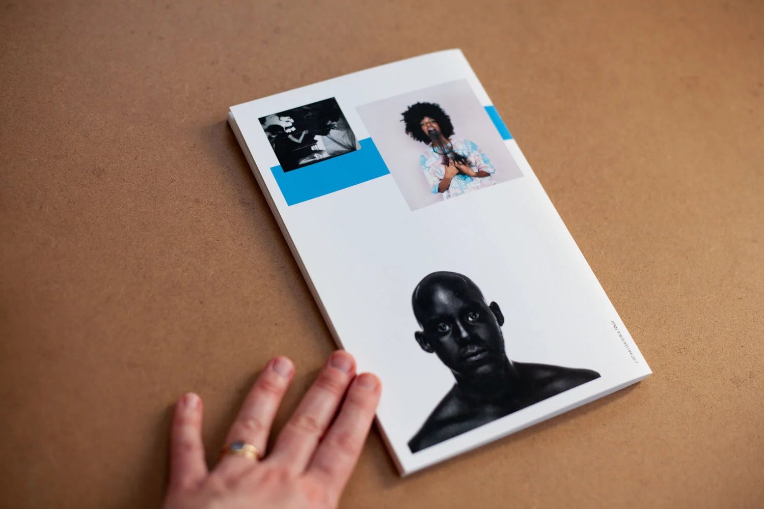
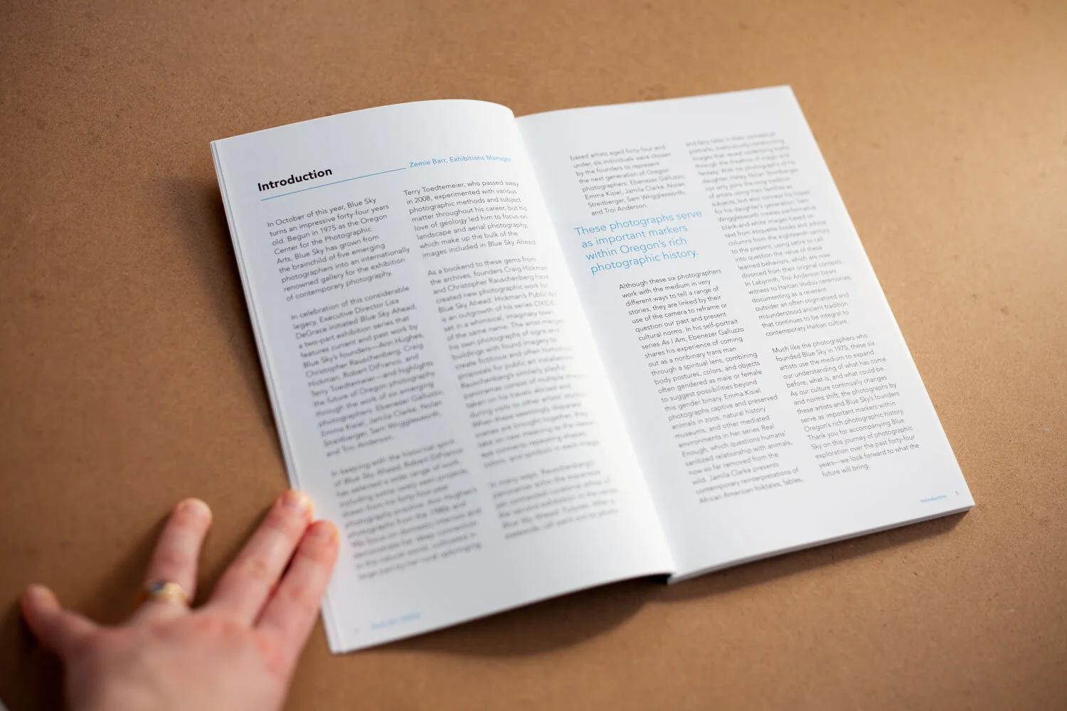
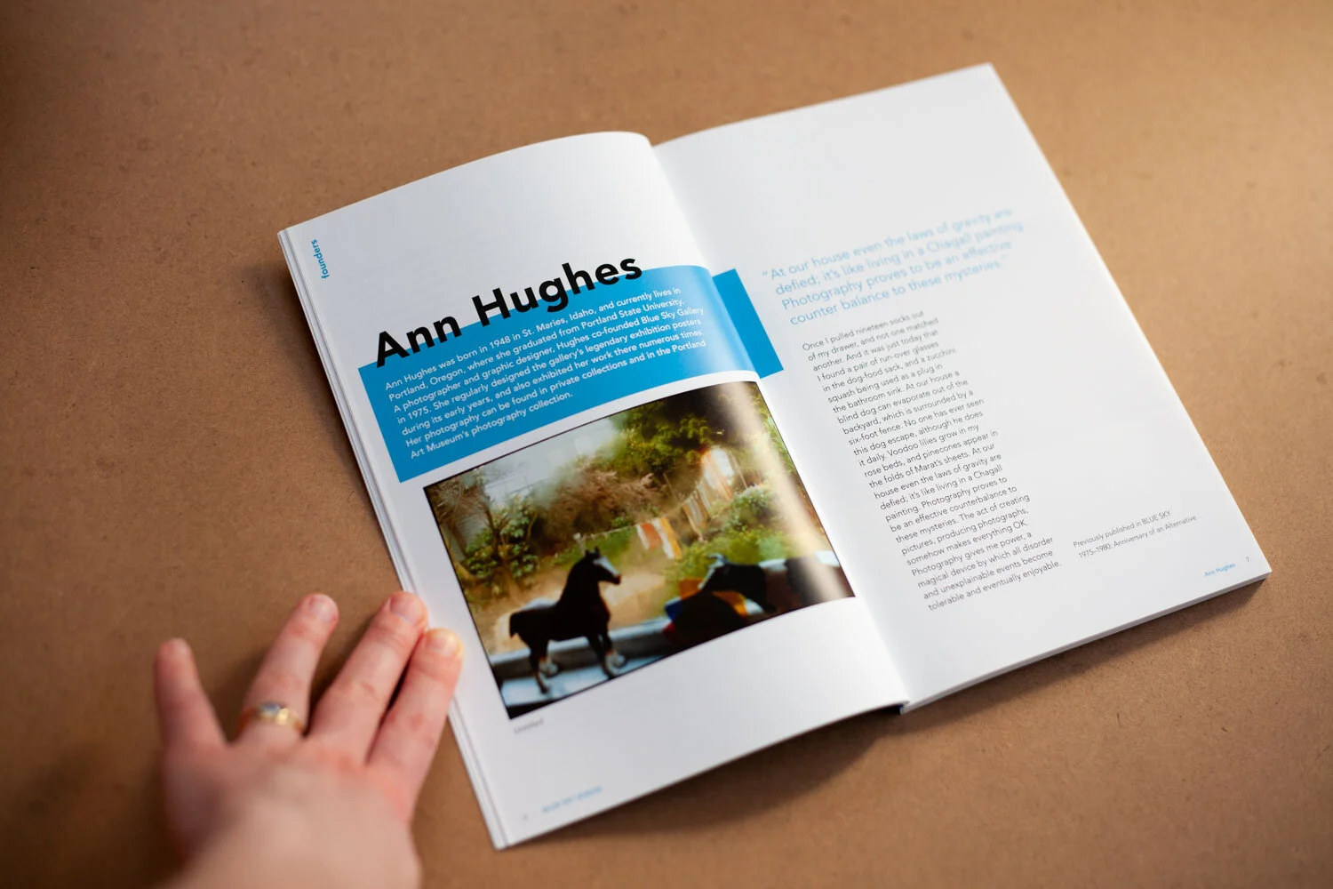
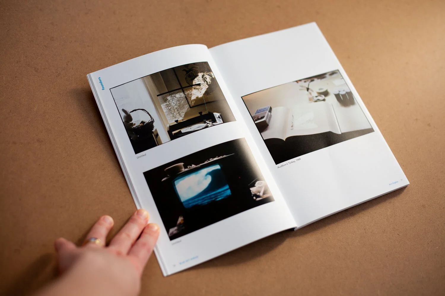
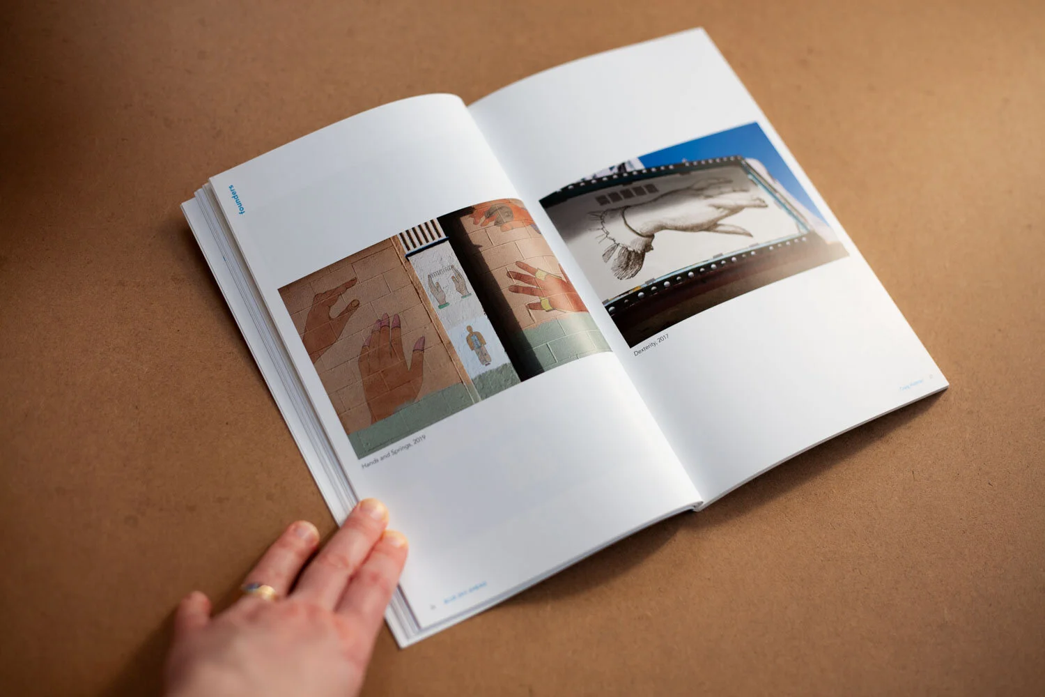
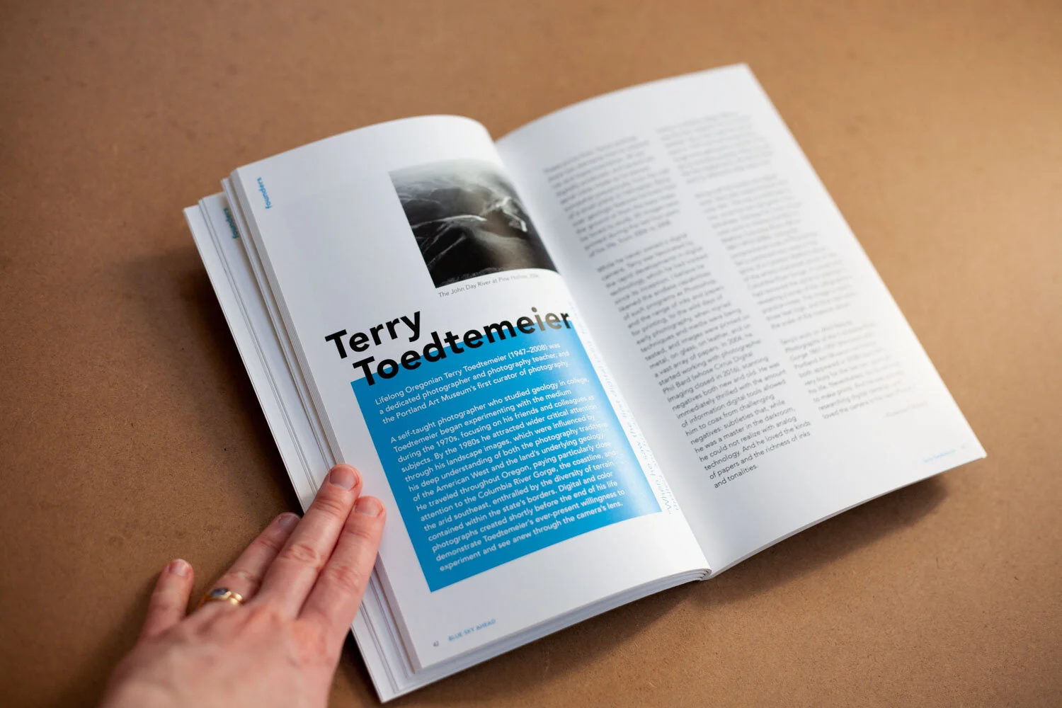
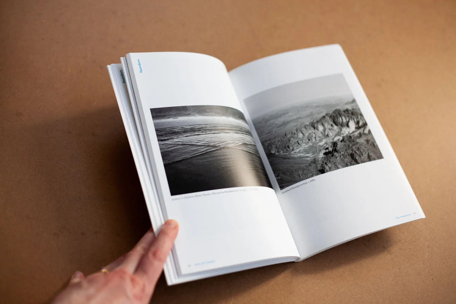
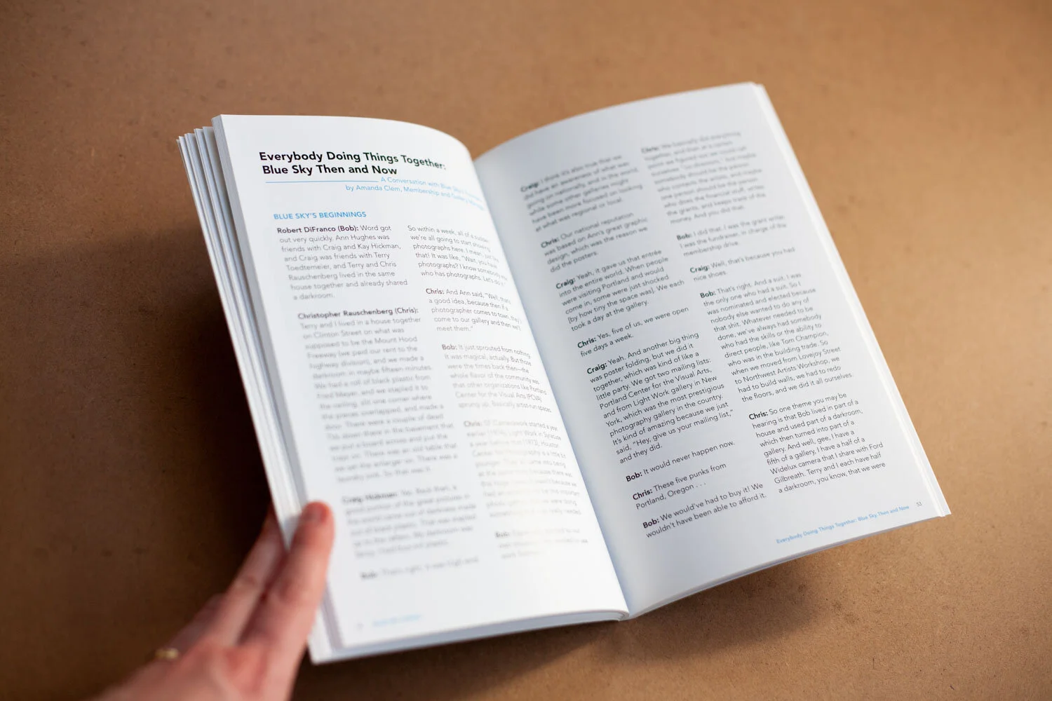
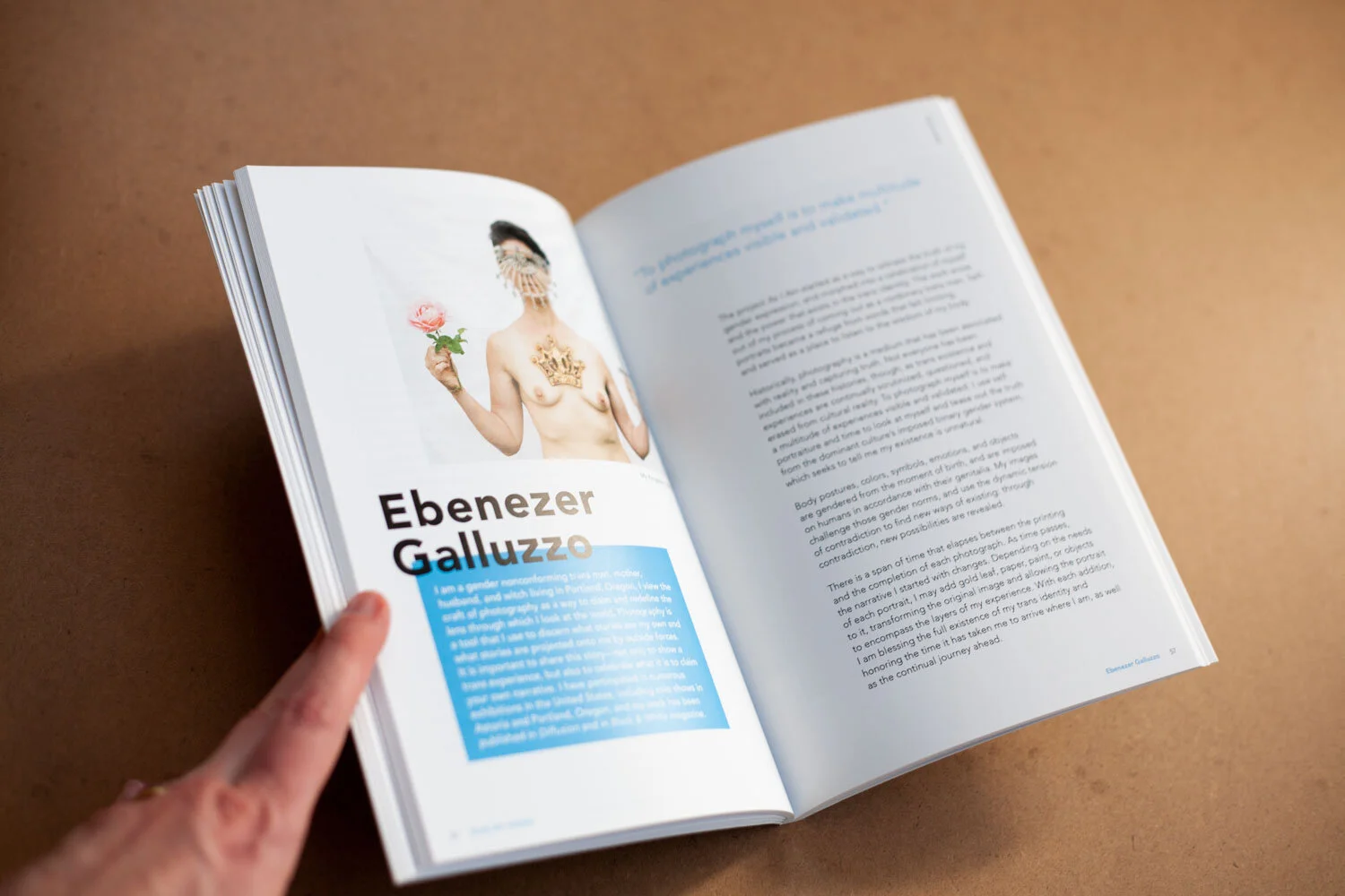
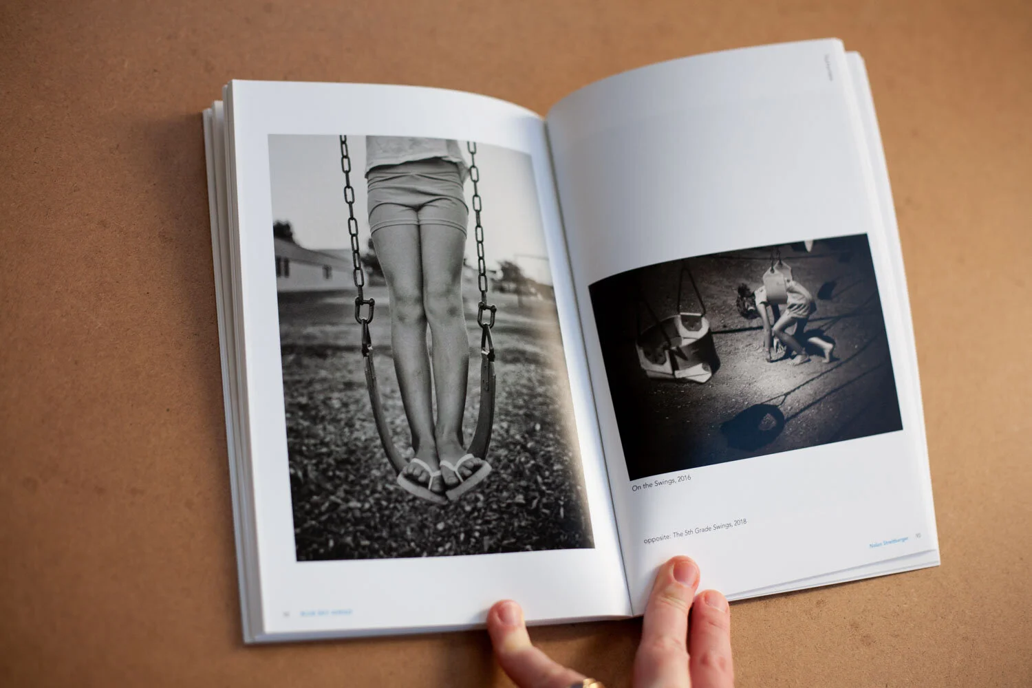
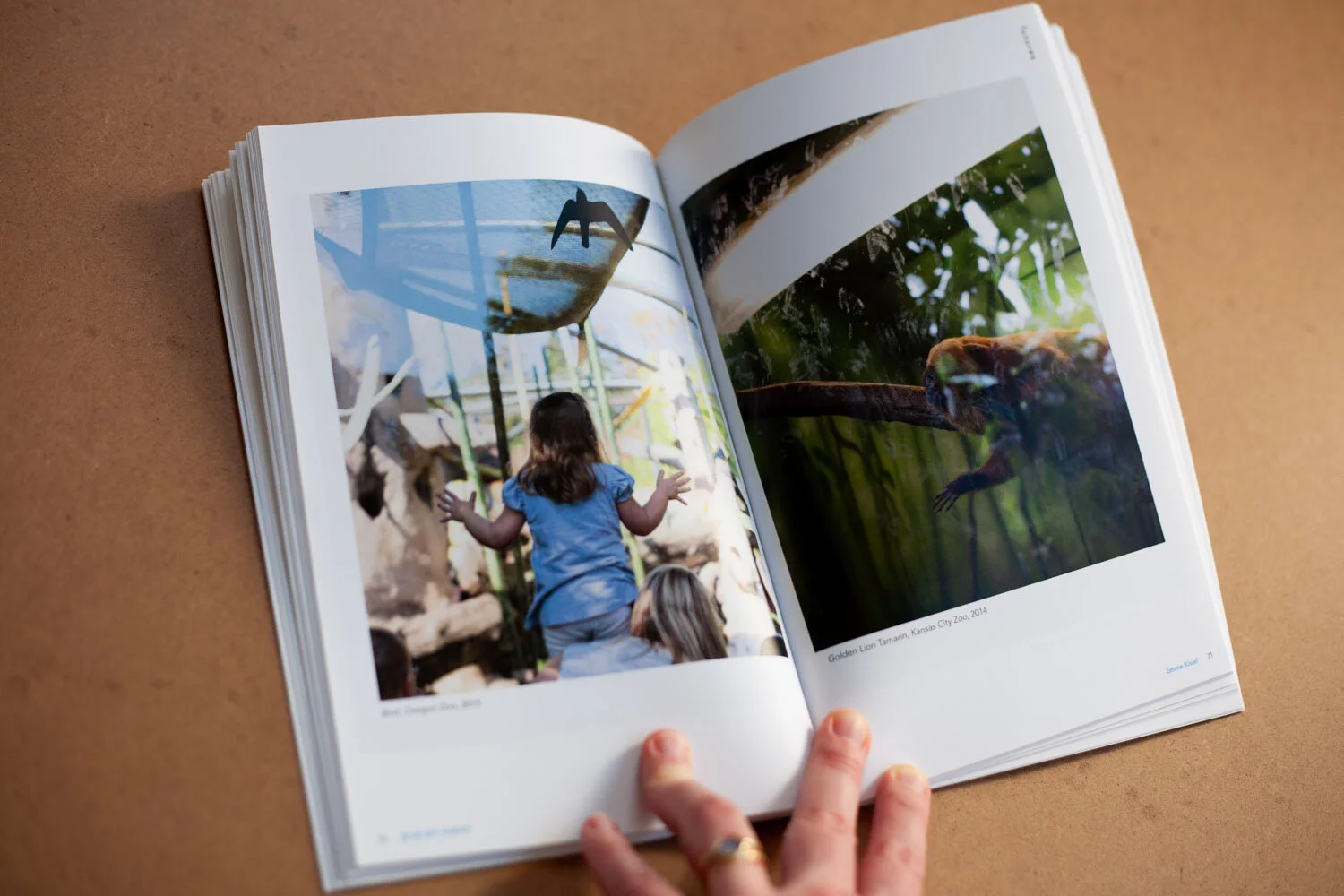
Blue Sky Ahead: Founders Futures 2019 Exhibition Catalog
Bridging the gap between the beginning of Blue Sky Gallery and the cutting edge of photography, this exhibition celebrated the still-compelling work of the founders, and their picks for where the medium is headed. The 144-page book included a few fold-out pages for extra-wide art and larger pieces, as well as some essays and letters.
It was also important that this catalog followed the aesthetic I’d created for Embodied, a couple of years before (see below).
For Blue Sky, I manage the project timeline and all production aspects, while their team heads communication with the artists and creation of content.


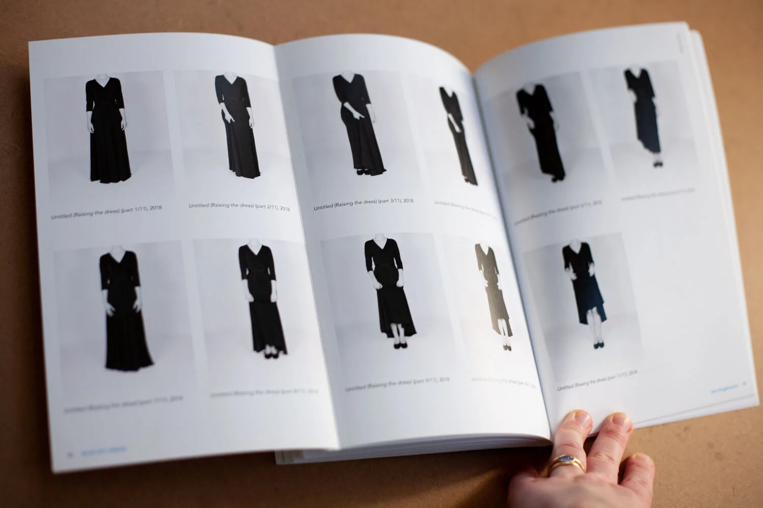
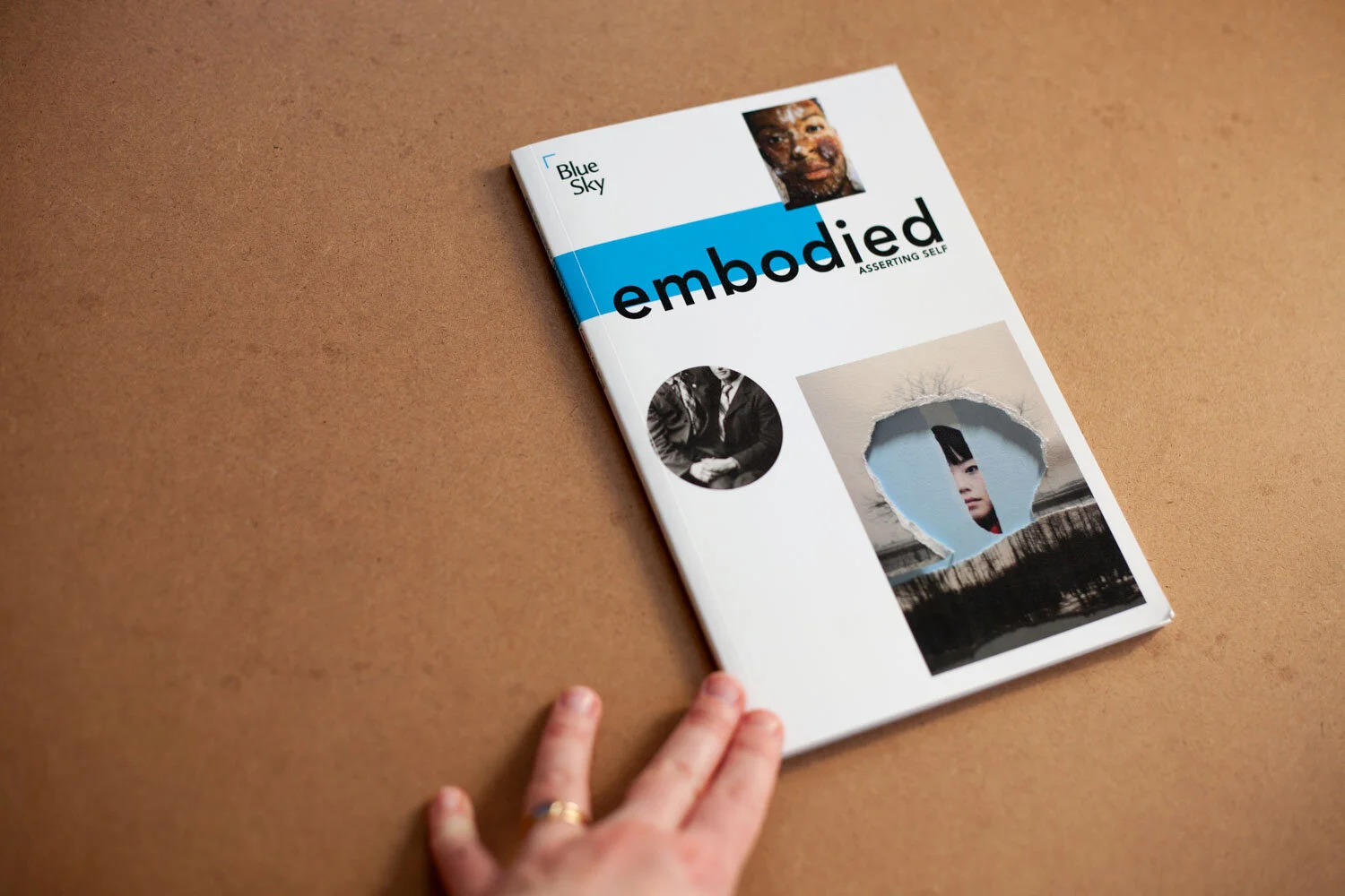
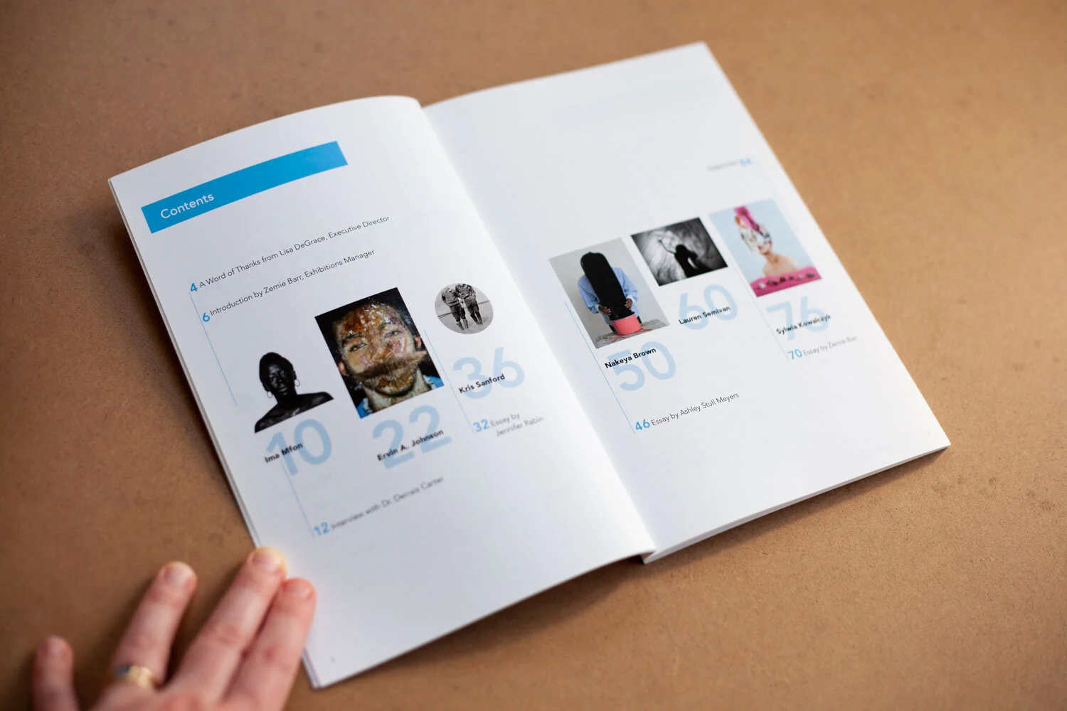
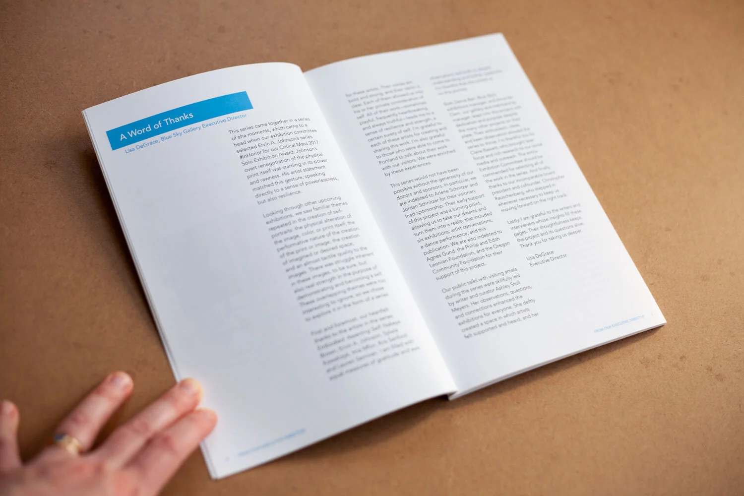
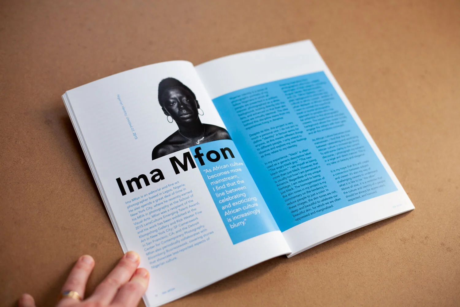
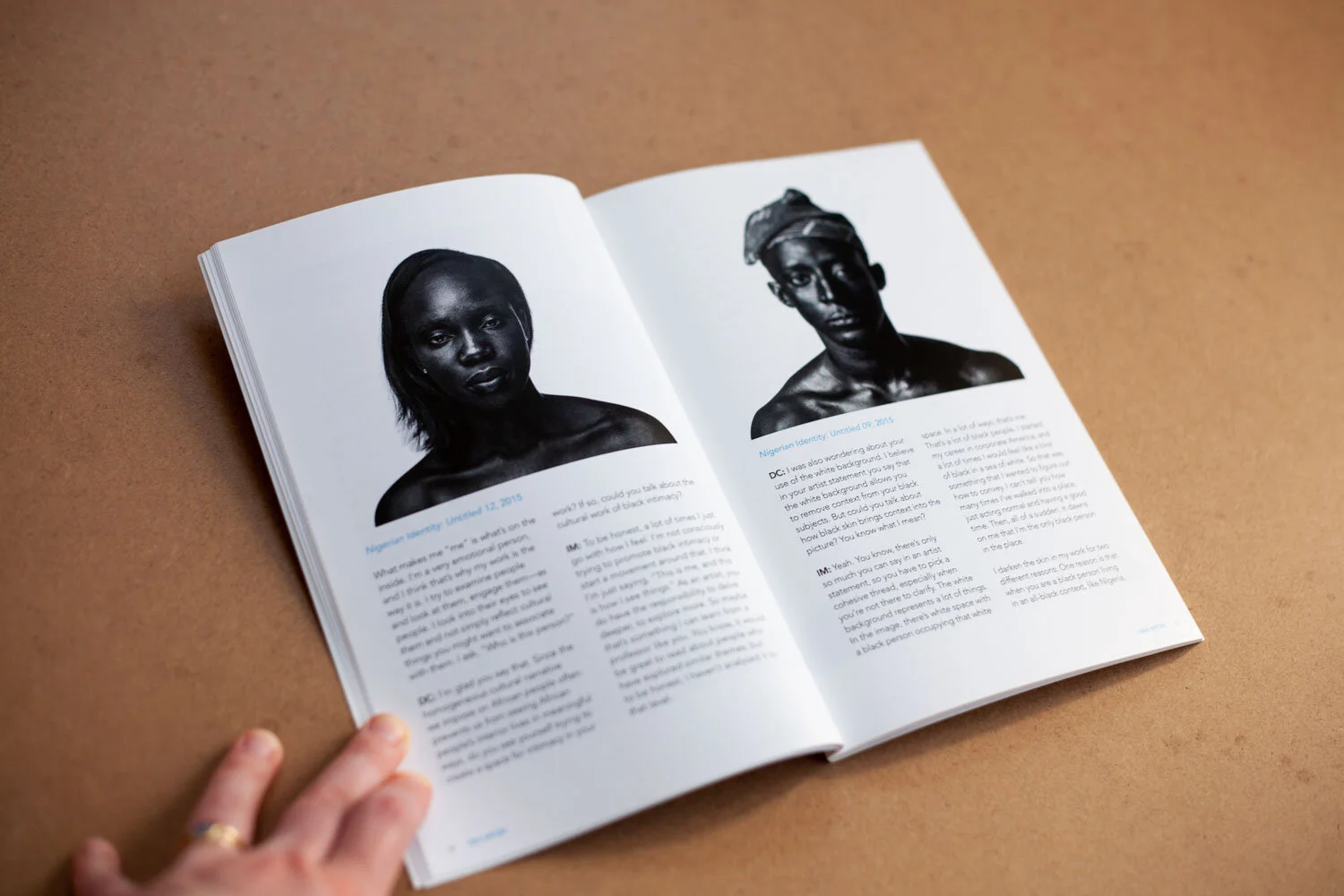
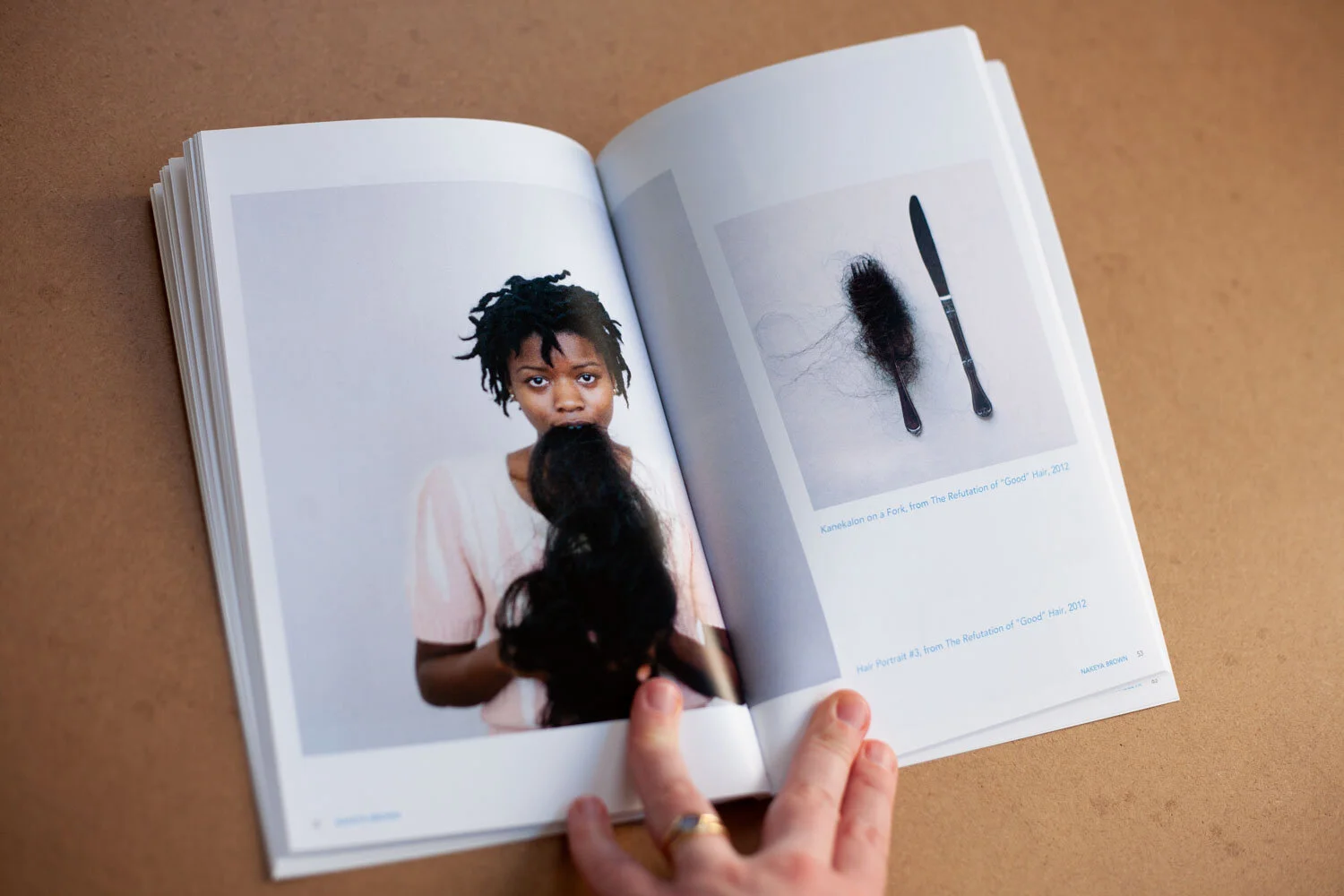
Embodied 2017 Exhibition Catalog
My first project with Blue Sky was for an exhibit that brought together artists who were exploring the concept of the body in various ways. Executive Director Lisa DeGrace said, “We don’t want this to look like a simple catalog—we want something with personality.” Drawing on their brand elements and using the artwork as inspiration, I created this 84-page catalog to celebrate their bodies (ahem) of work and hold them together with strong visual elements.
I connected with the good folks at Brown Printing to scope out the project. This digital print uses a soft-touch aqueous coating for the covers, and features a simple binding with teeny-tiny spine.